John Hancock’s Digital Advice team (JHA) needed a variety of updated worksheets, flyers, banners, brochures, and more to support their various marketing initiatives. These assets advertised JHA’s newest events and the team’s personalized financial plans; they were shown to both potential clients and current employees.
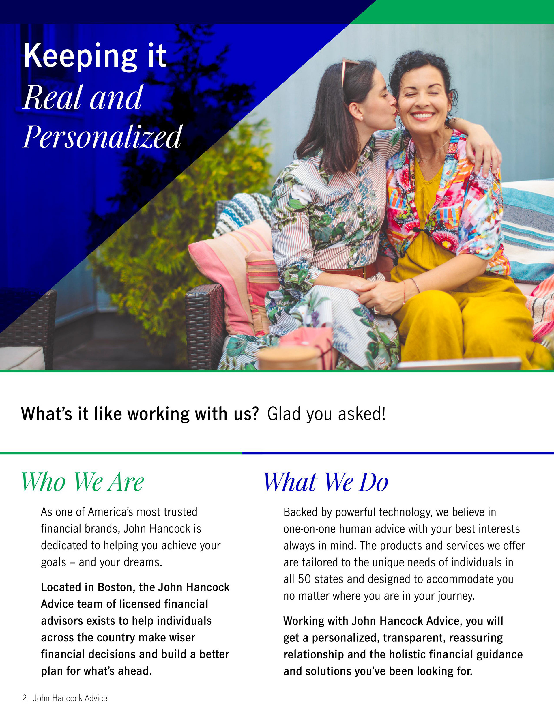
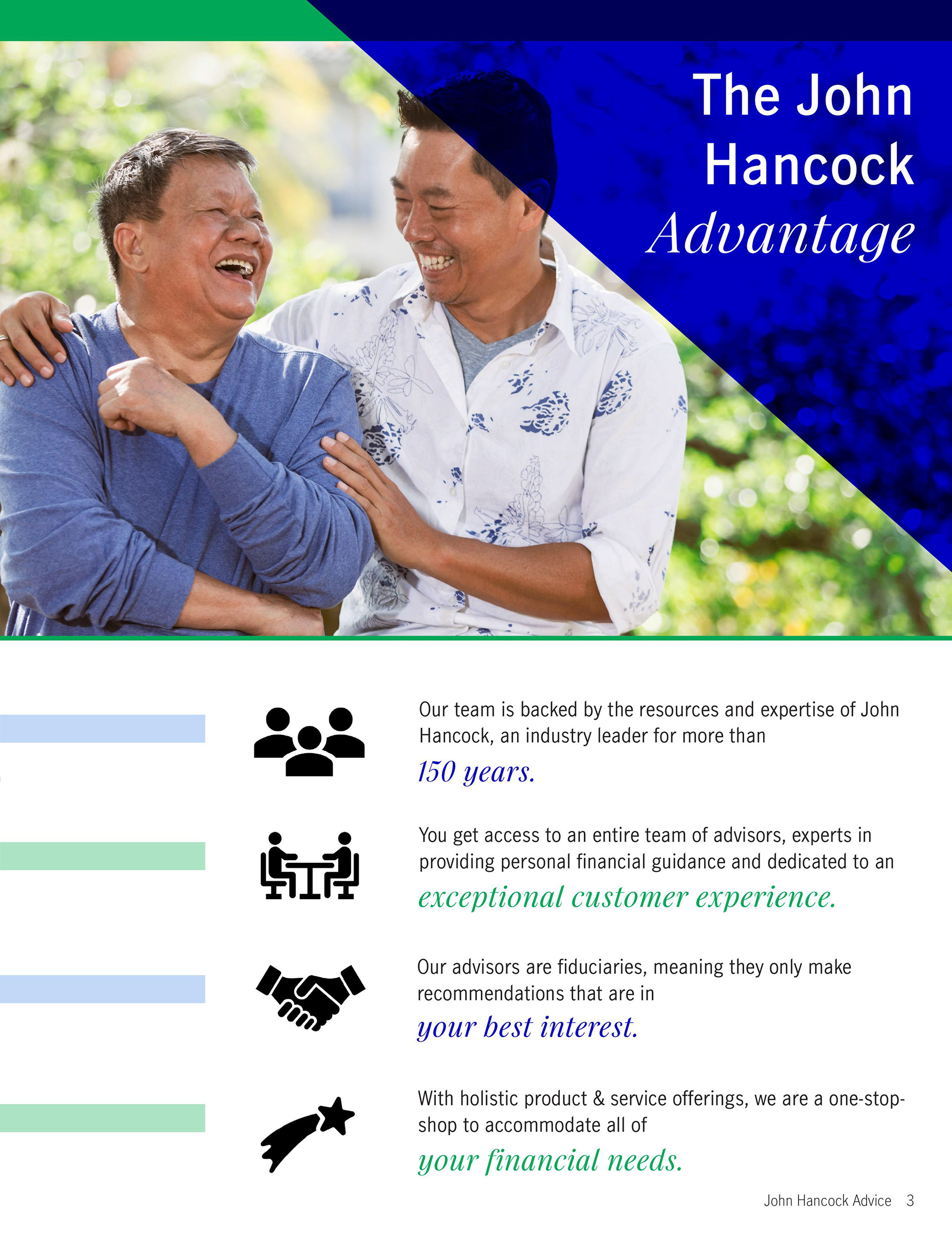

Displayed above, for example, are two pages excerpted from the JHA brochure that I redesigned. (For comparison, a page from the original brochure is also displayed in a smaller size.) Brochures were sized at 8.5 x 11 in. (letter size) and were formatted to account for cropping.
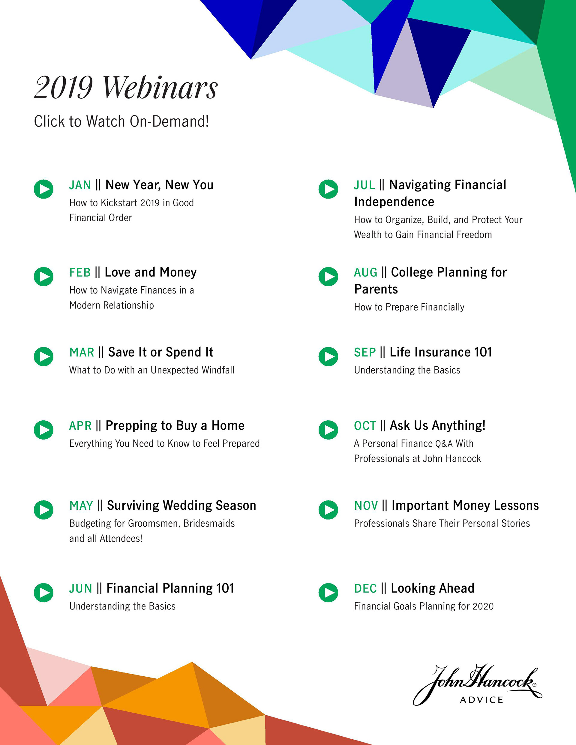

JHA held monthly webinars for financial education. Above are a set of matching flyers giving information about these webinars that I created. Companies that worked with JHA distributed these PDFs to their external clients. Flyers were also sized 8.5 x 11 in. (letter size).

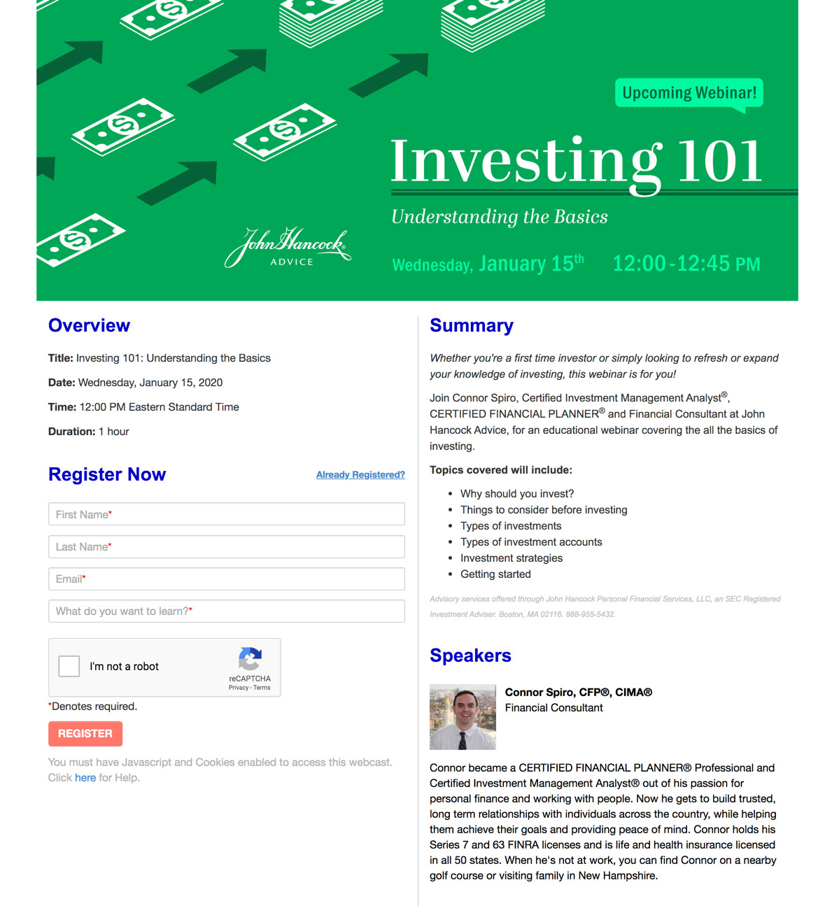
Lastly, I designed many banners like the one above, also for the promotion of JHA's monthly webinars. These were displayed on the webinar registration page and in marketing emails.
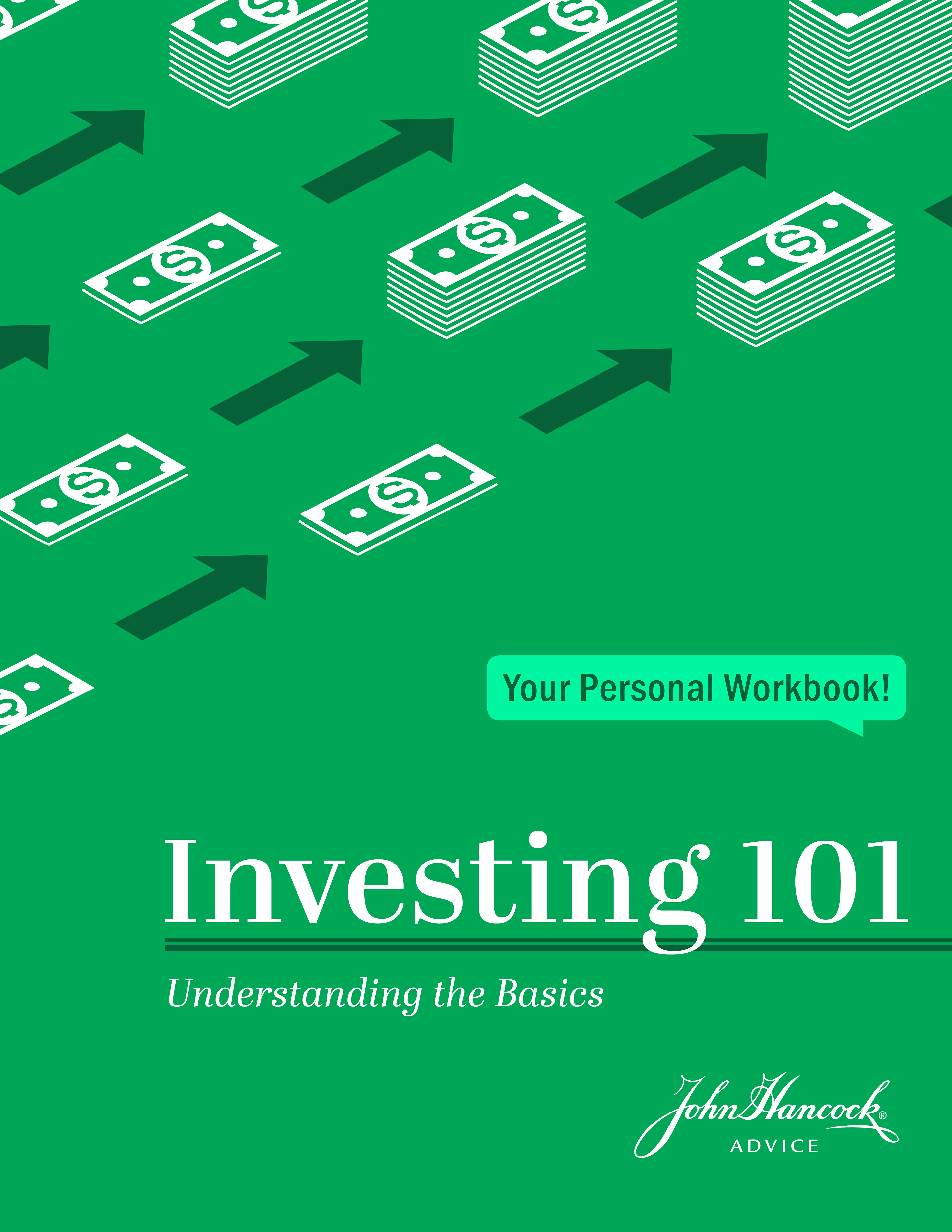
A matching personal financial workbook was also created for attendees. These workbooks were downloadable PDFs that allowed you to follow the webinar content. The workbook cover shown above is sized at 8.5 x 11 in. (letter size).
process
Historically, John Hancock has been associated with retirement planning. However, the company was now targeting a slightly younger demographic than those looking for retirement. For all of these assets, my challenge was to give JHA a more contemporary look while still remaining faithful to the brand’s set colors and fonts.

For this specific banner on investing, I wanted something clean and visually striking. Because investing is growing your money, I started with imagery of plants. Eventually though, I felt that the growing stacks of dollar bills made the message more clear.
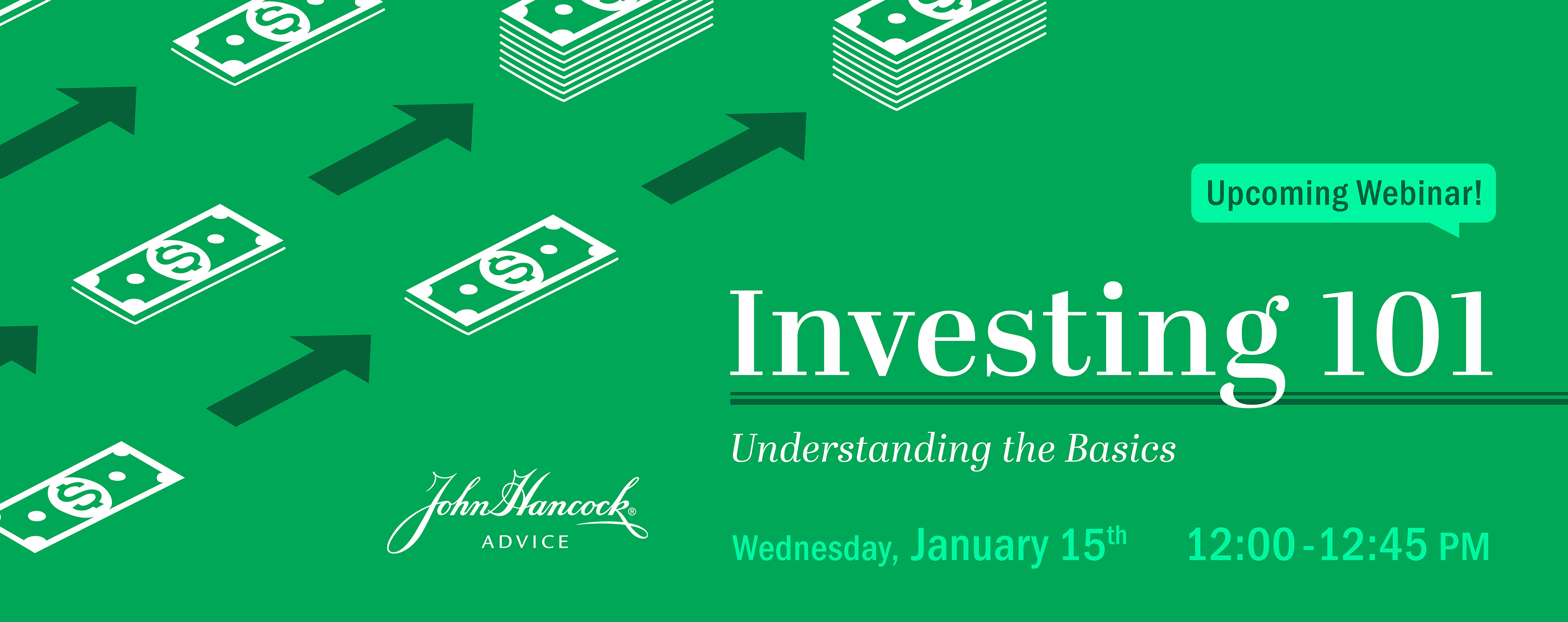
In this final version, the upward angle of the stacks and the arrows makes the composition more dynamic. I picked a serif typeface for the webinar title and subtitle that would contrast the modern design everywhere else.

I also designed banners and workbook covers with alternate color schemes. However, because green is associated with growth and money, the use of the JH brand blue didn't speak to the concept of investing as much as their brand green did.