
process
Draft 1 (Version A)
Draft 1 (Version B)
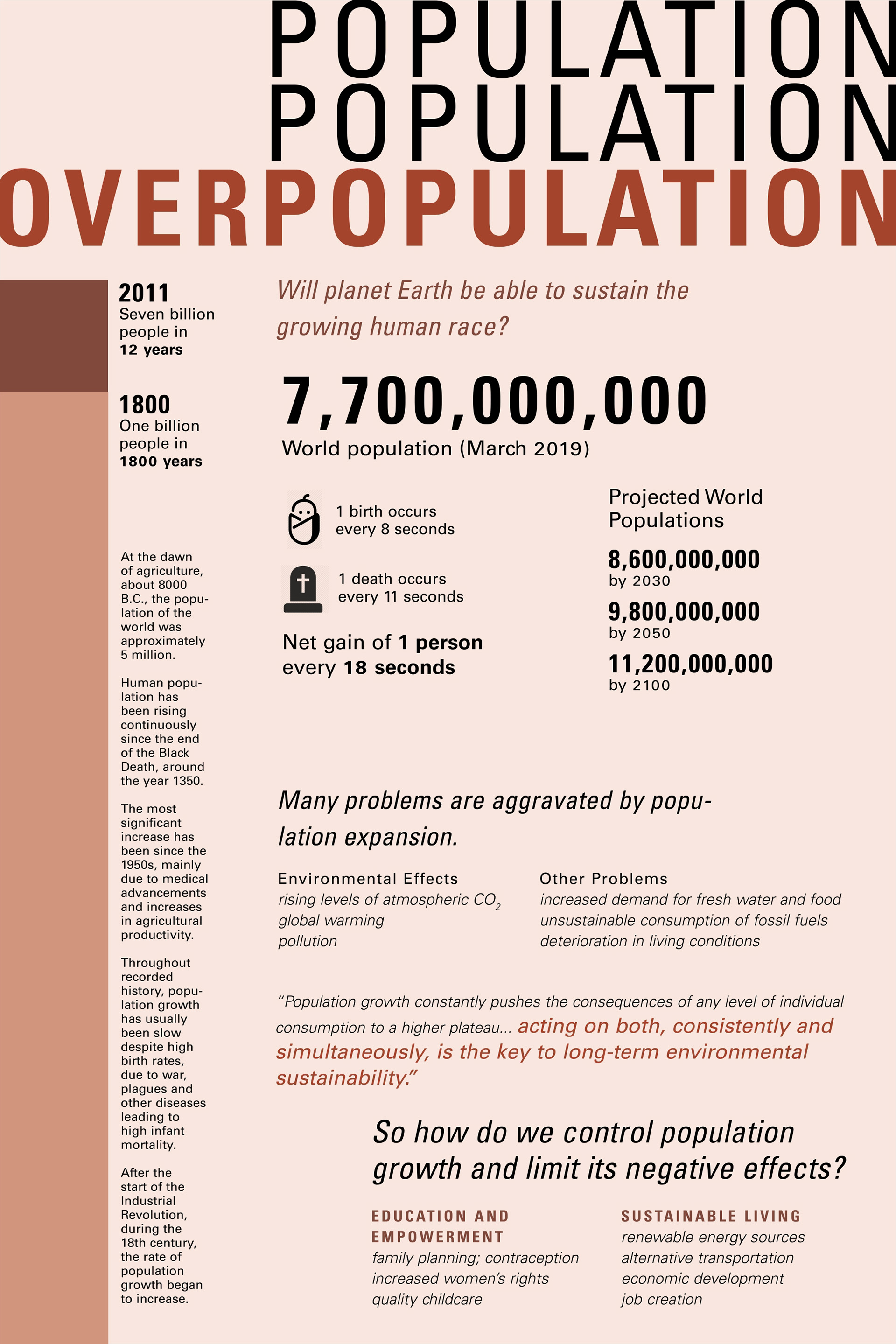
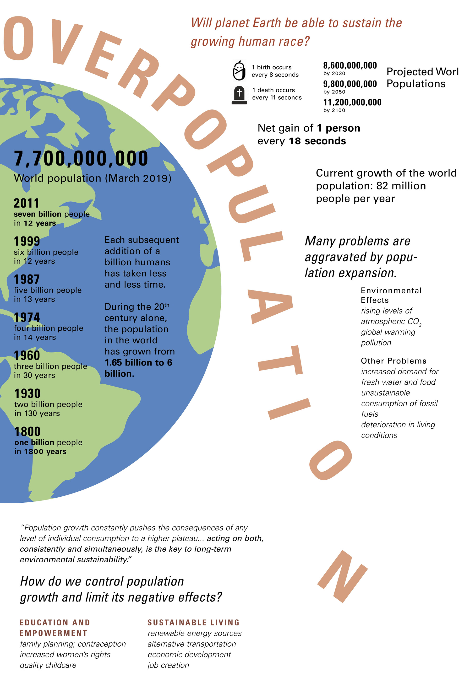
From the very beginning, my color scheme was guided by skin tones to match the idea of human population. I had two different ideas for representing overpopulation with text. The first was using the word "population" stacked on top of itself (displayed above on the right), and the second was using the idea of "overpopulation" falling off planet Earth (displayed on the left). The former felt too static though, and the latter was difficult to organize information around in a logical way.
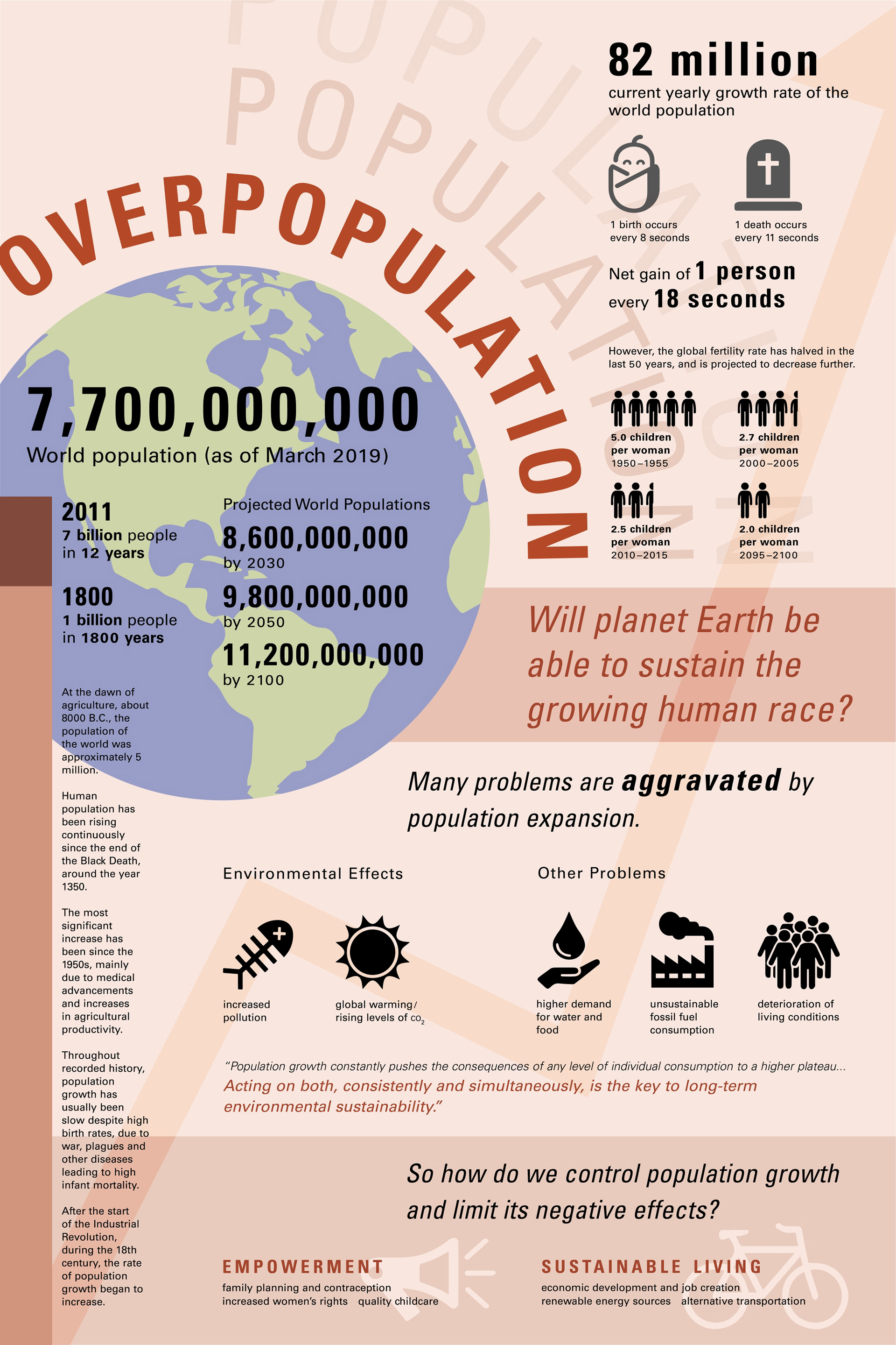
My solution was to combine the two ideas in my second draft. I also added a bar to display historical data on population growth and more icons.
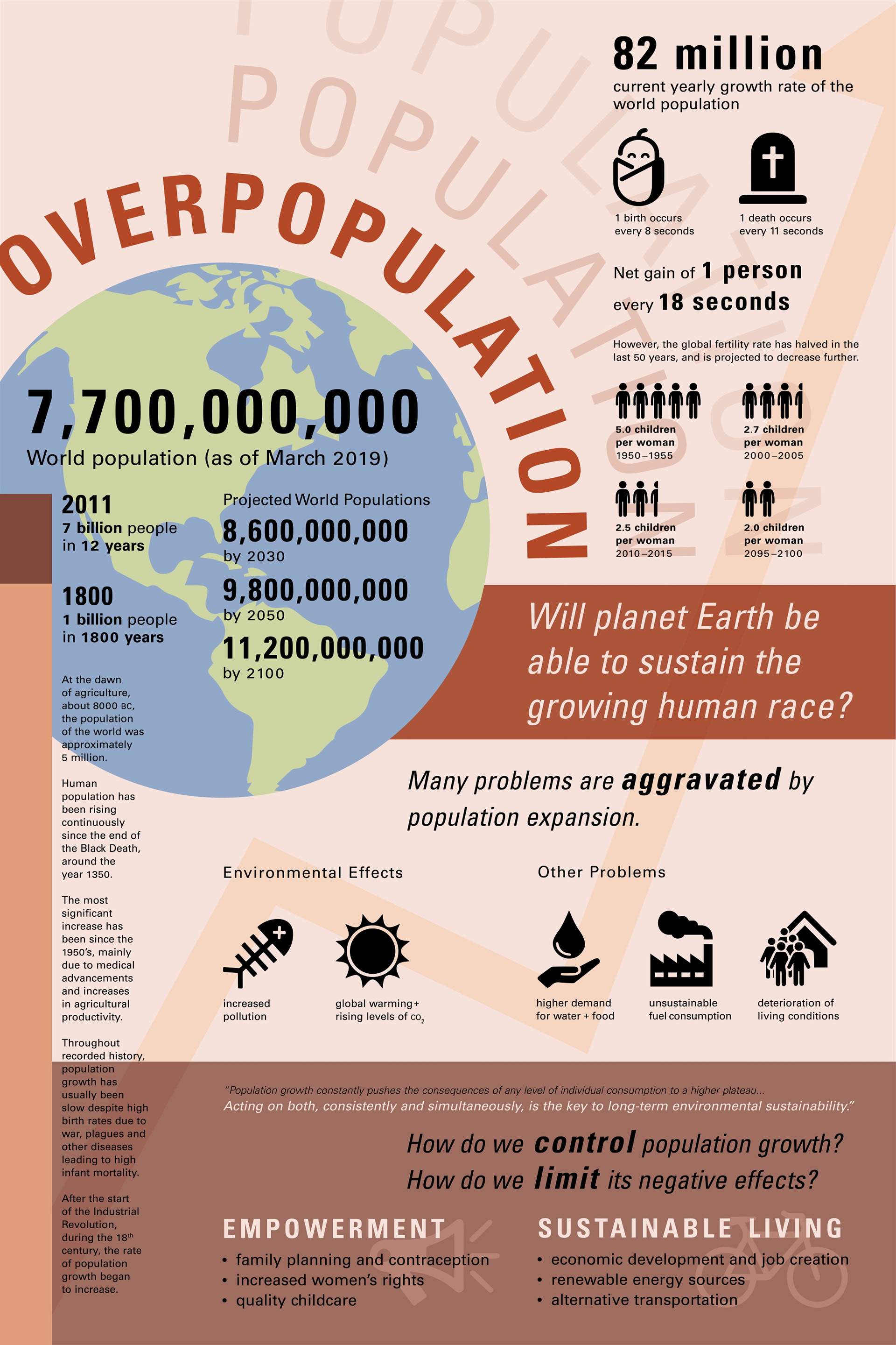
Finally, I adjusted the color scheme to have more contrast. I used color to highlight more important areas of the poster, such as the tag line "Will planet Earth be able to sustain the growing human race?" and the bottom call to action.