
process
A list of twenty typefaces was given. I was first asked to create twenty combined “logos” created by combining two letters from each typeface.

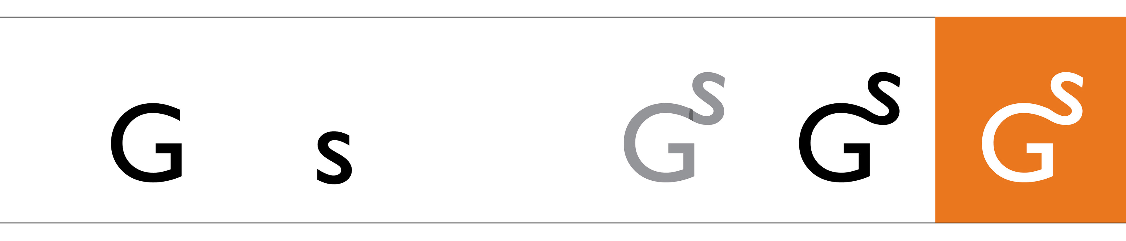
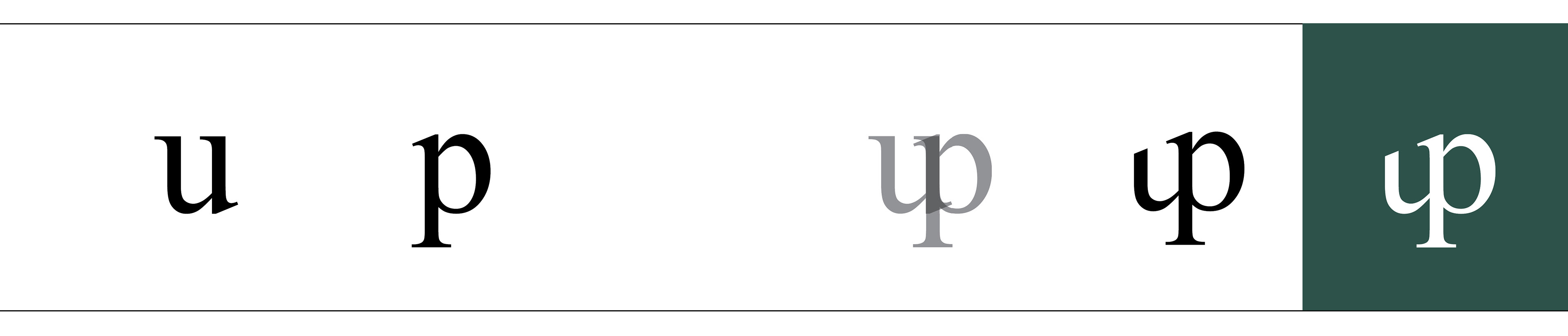
Creating logotypes was much more exploration than searching for a “correct” solution. There were some easy, tried-and-true choices of letter combinations, but I enjoyed more picking letterforms that didn’t seem like they could fit together. Through this, I found some quirky logotypes with a lot of personality.
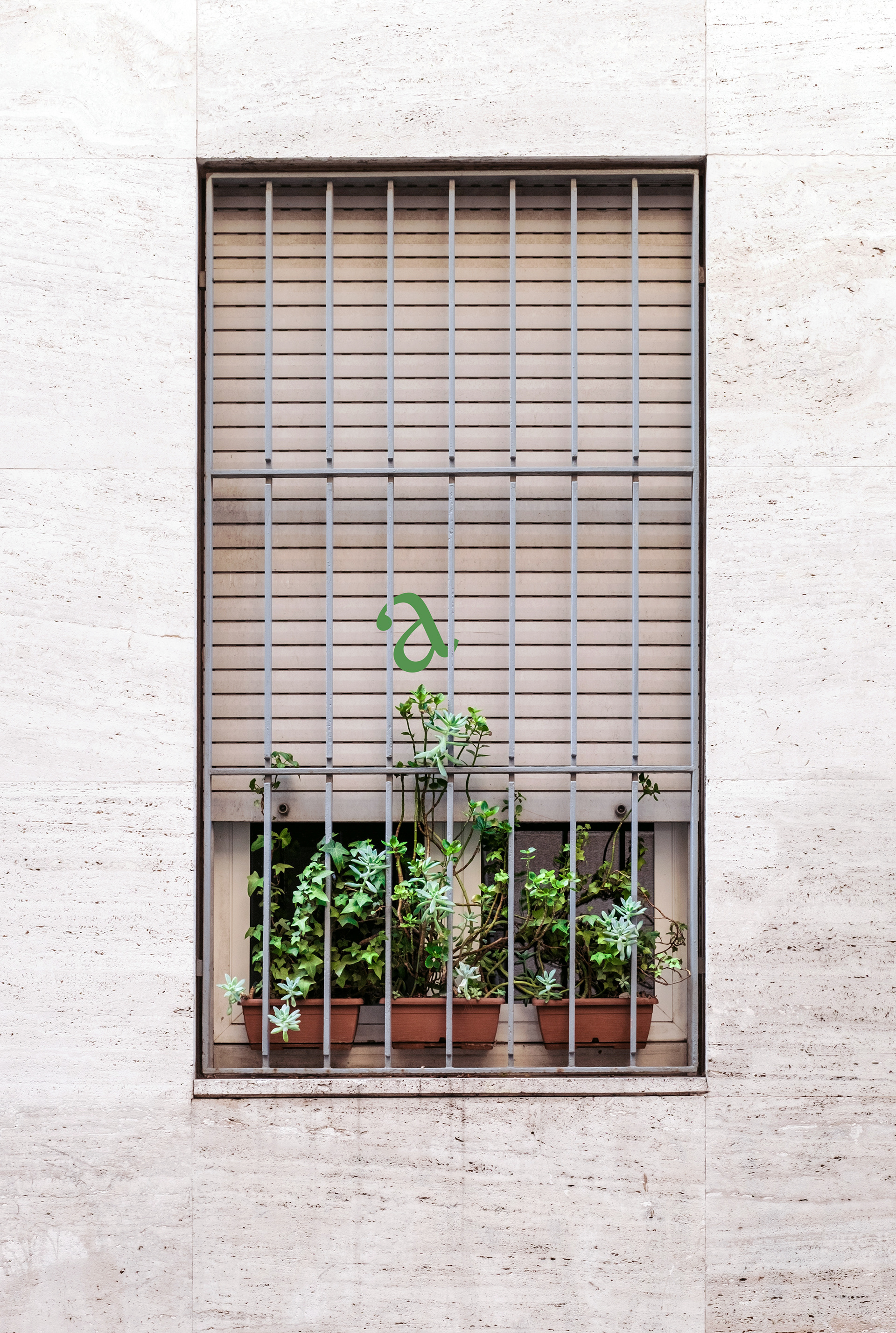
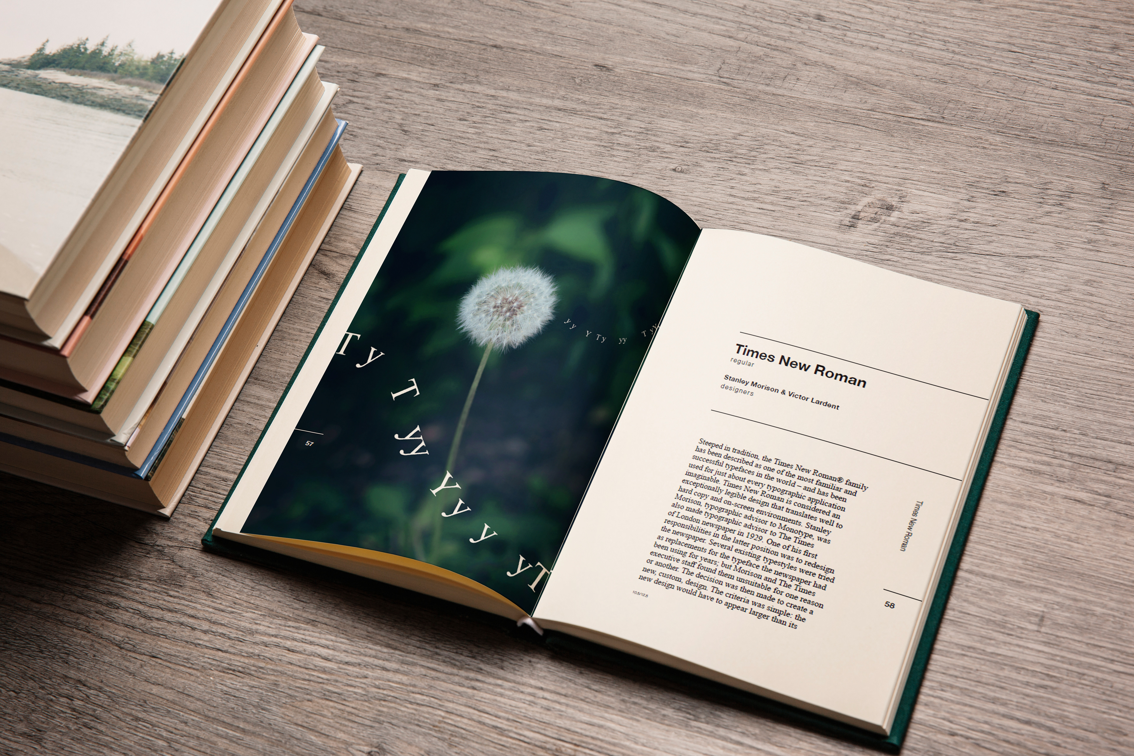
Then, I created a series of plate designs to begin each section and highlight each typeface. There were no restraints on the content of the designs, but the plates had to be cohesive and simultaneously distinctive. The text and general format of the book was given, but I had to create a layout grid.


This is what a final two page spread looks with a plate design and corresponding logotype design. Below are more examples of spreads.


Designing a plate series was the most difficult—and the most fun—part of this project. The plates had to work in tandem without becoming repetitive, especially keeping in mind that a person would be flipping through twenty sections. In order to create a successful rhythm, I learned to keep a few set plate design ideas in mind. I varied the same choice elements: color, distance of the photo, text size, and text “movement” (whether the letters were winding, in a scattered pattern, circular, or singular).
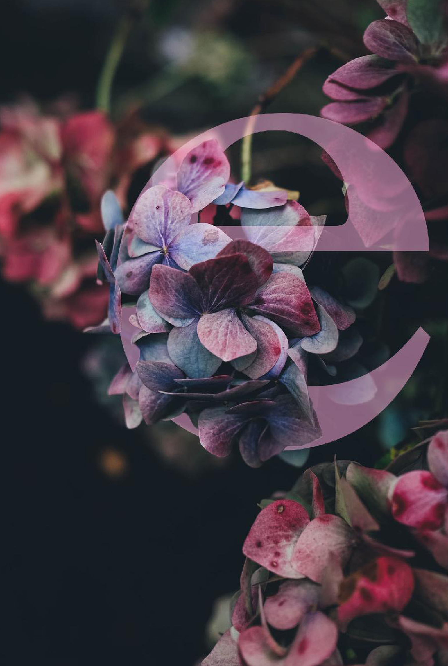

These are examples of my first plate drafts. My original ideas were very dark and static, which isn't very fitting for my whimsical garden of plate designs. Adding movement to the text and background added life and character.