


process
We don't often see organ donation advertisements—this meant there wasn't an existing or expected style for organ donation ads that I could subvert. So instead, I started with concentrating on coming up with very different concepts.
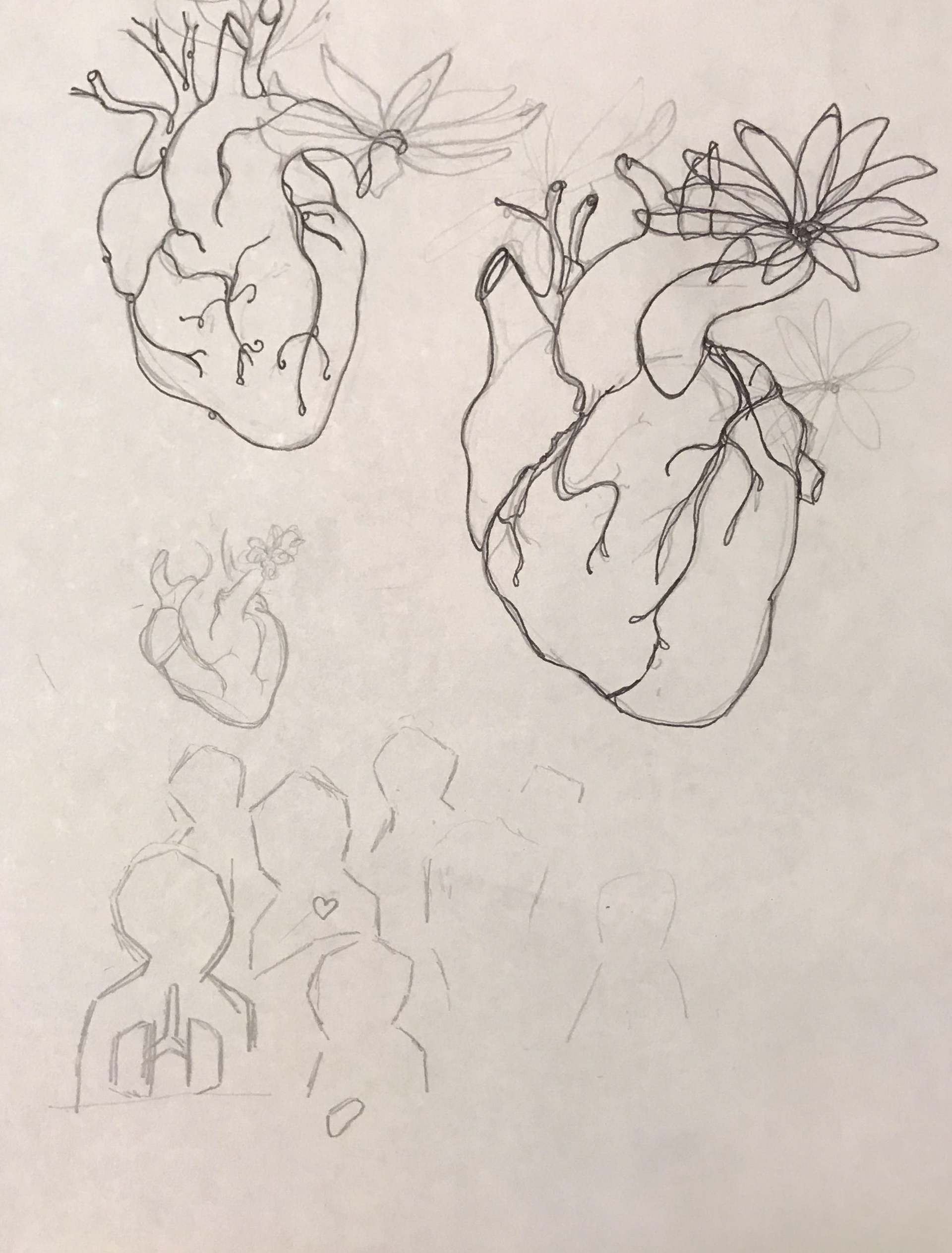

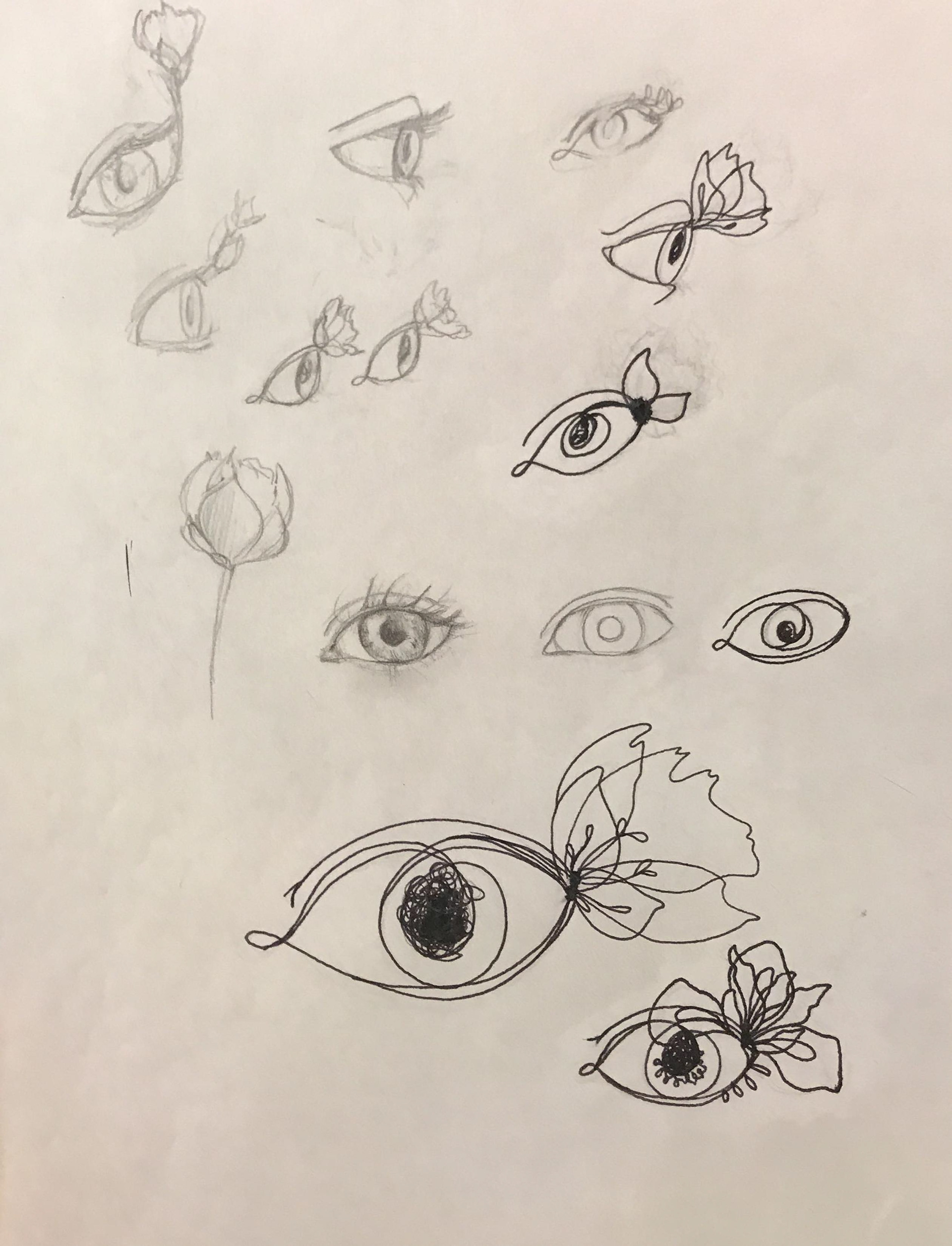
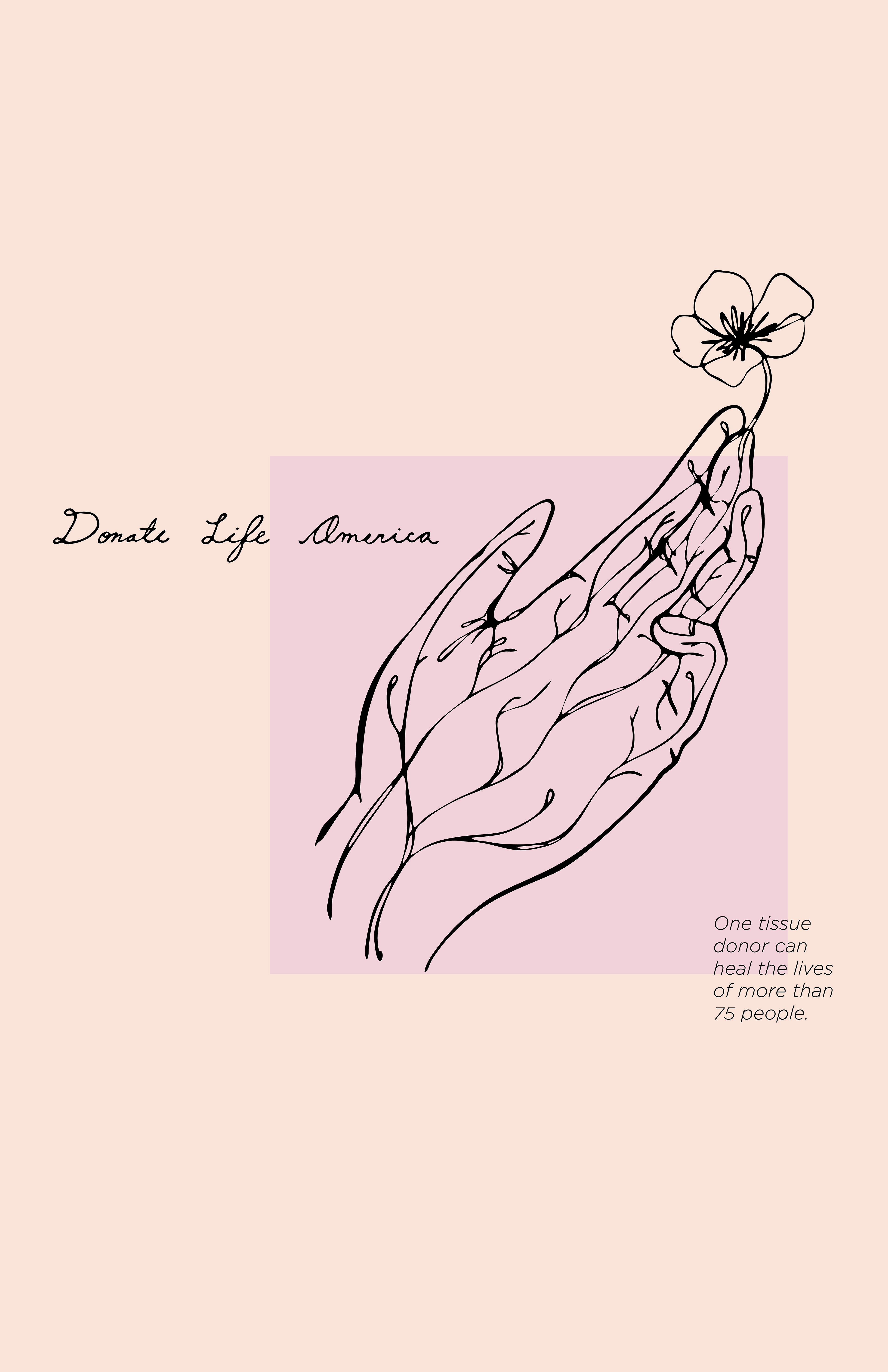
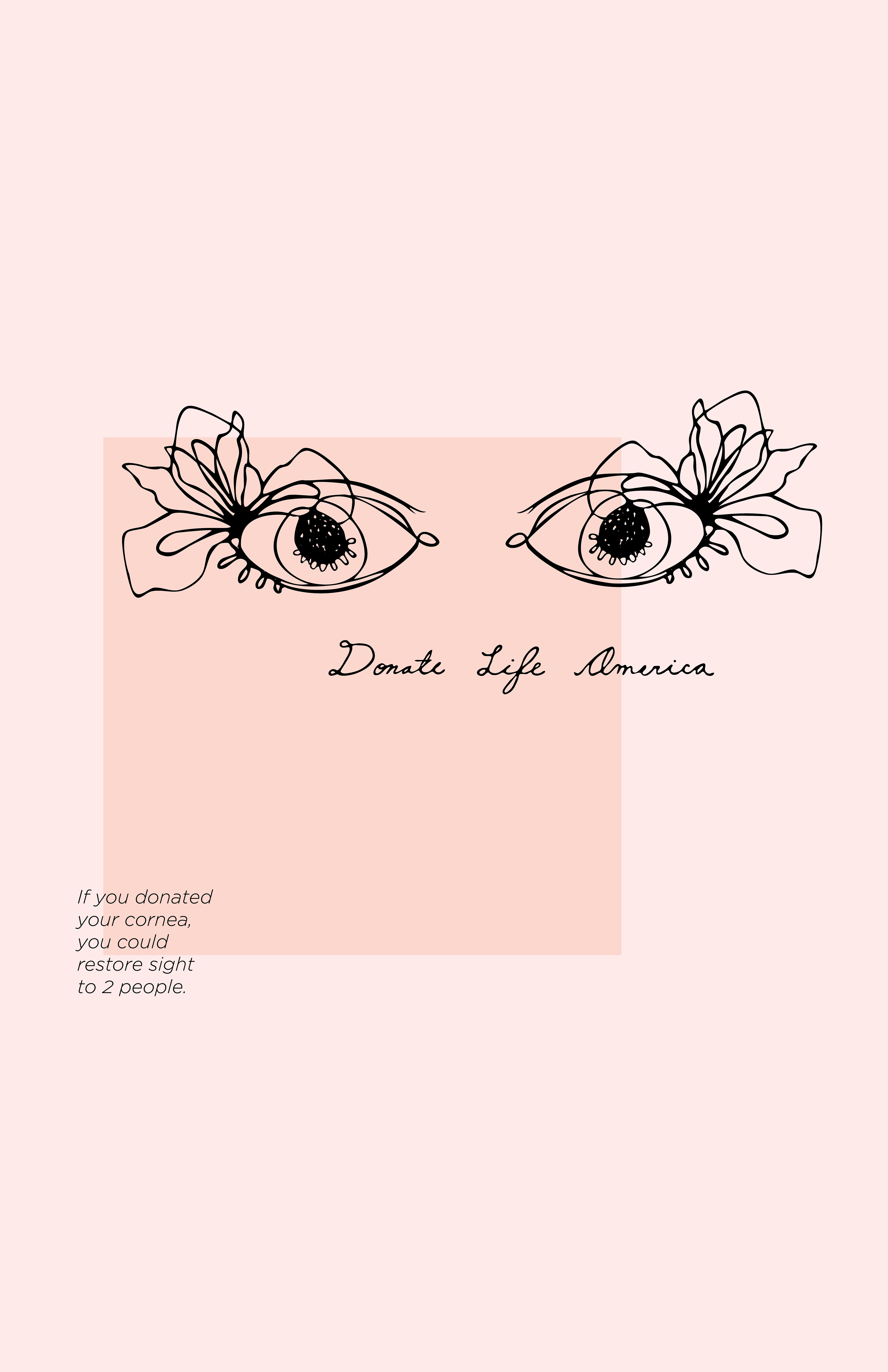
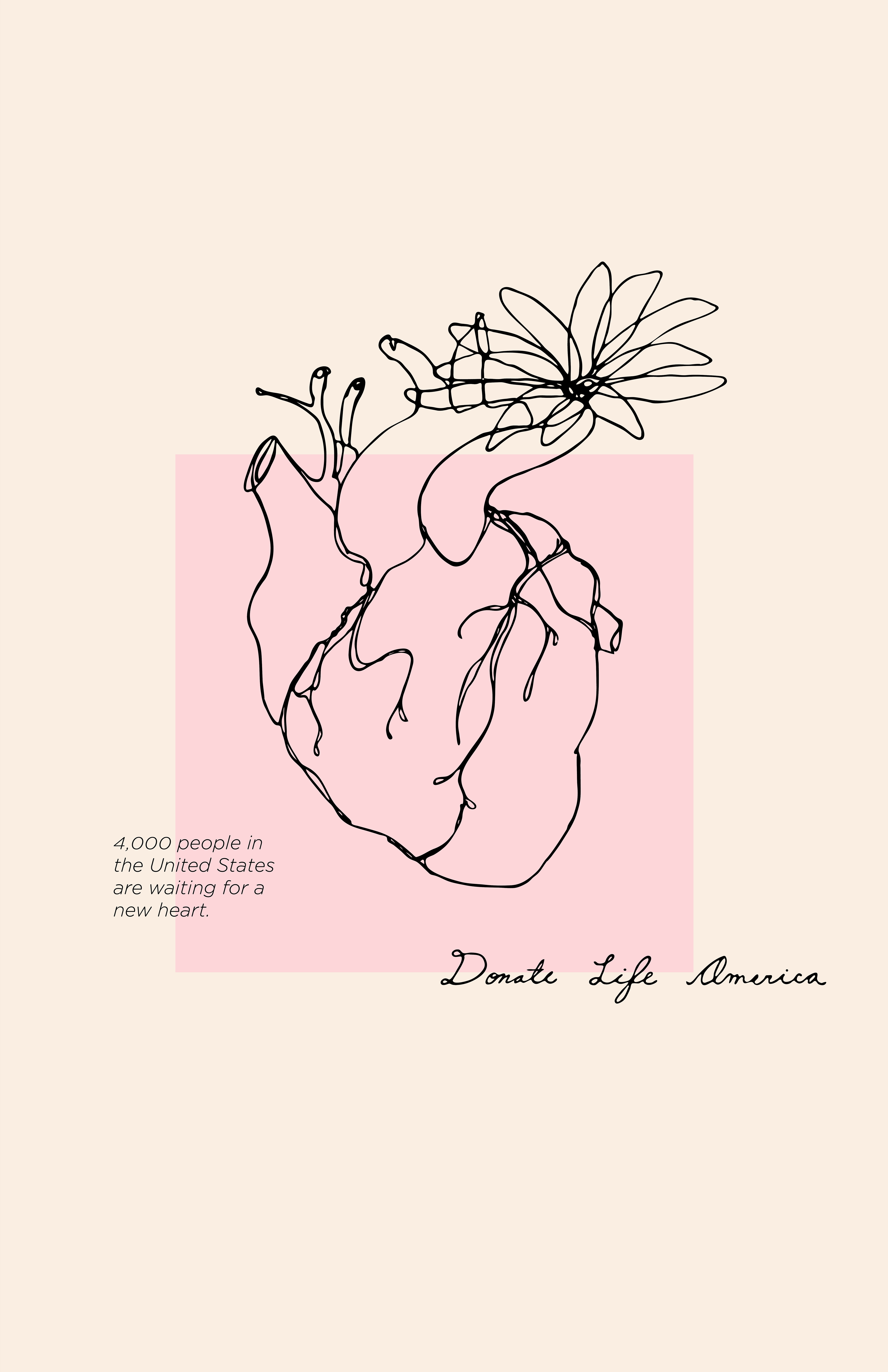
I eventually decided on something feminine, delicate, and slightly uncomfortable: flowers growing out of organs. It's a very literal way to represent sprouting new life and opportunity for others by giving away body parts.

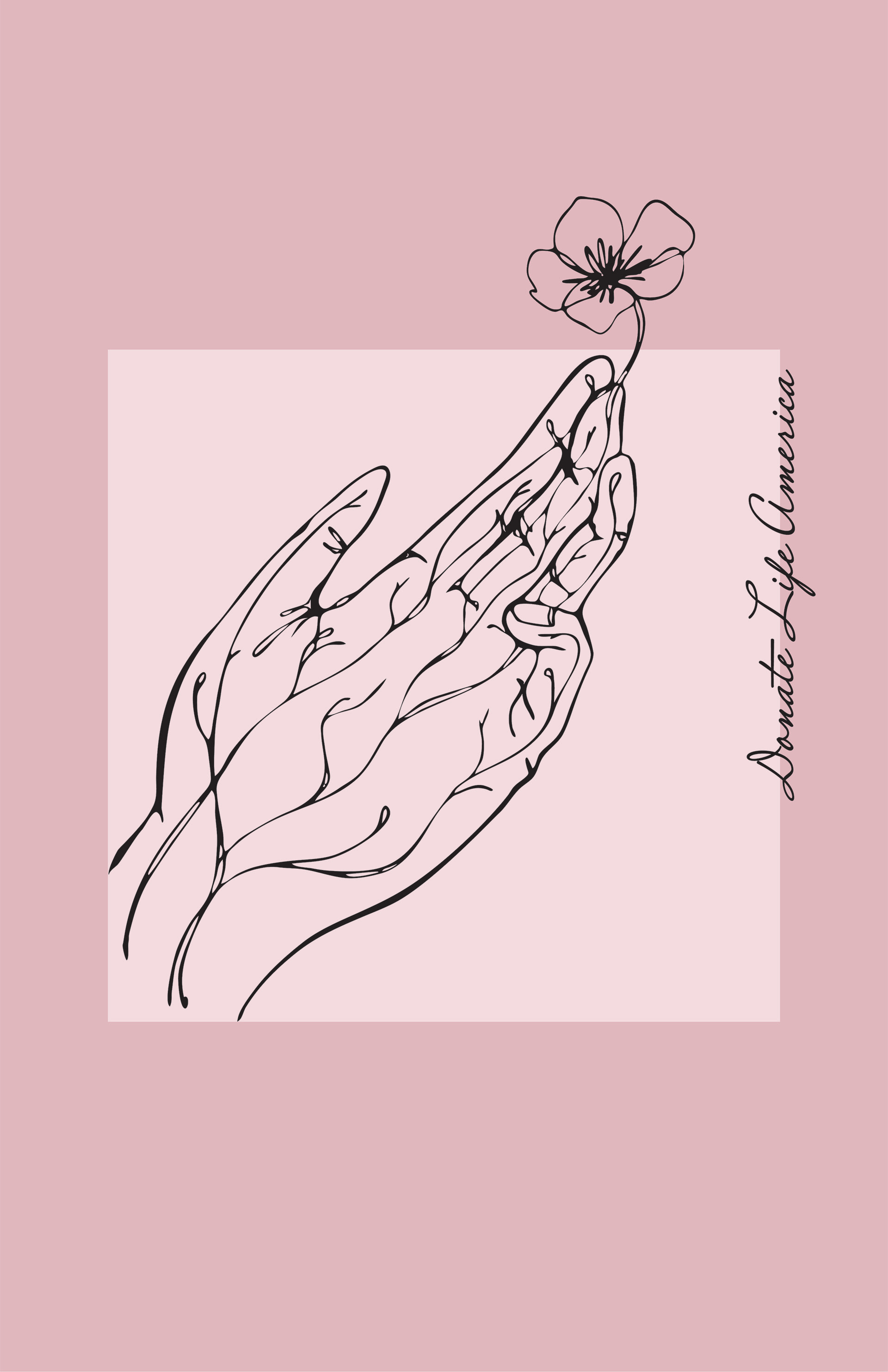

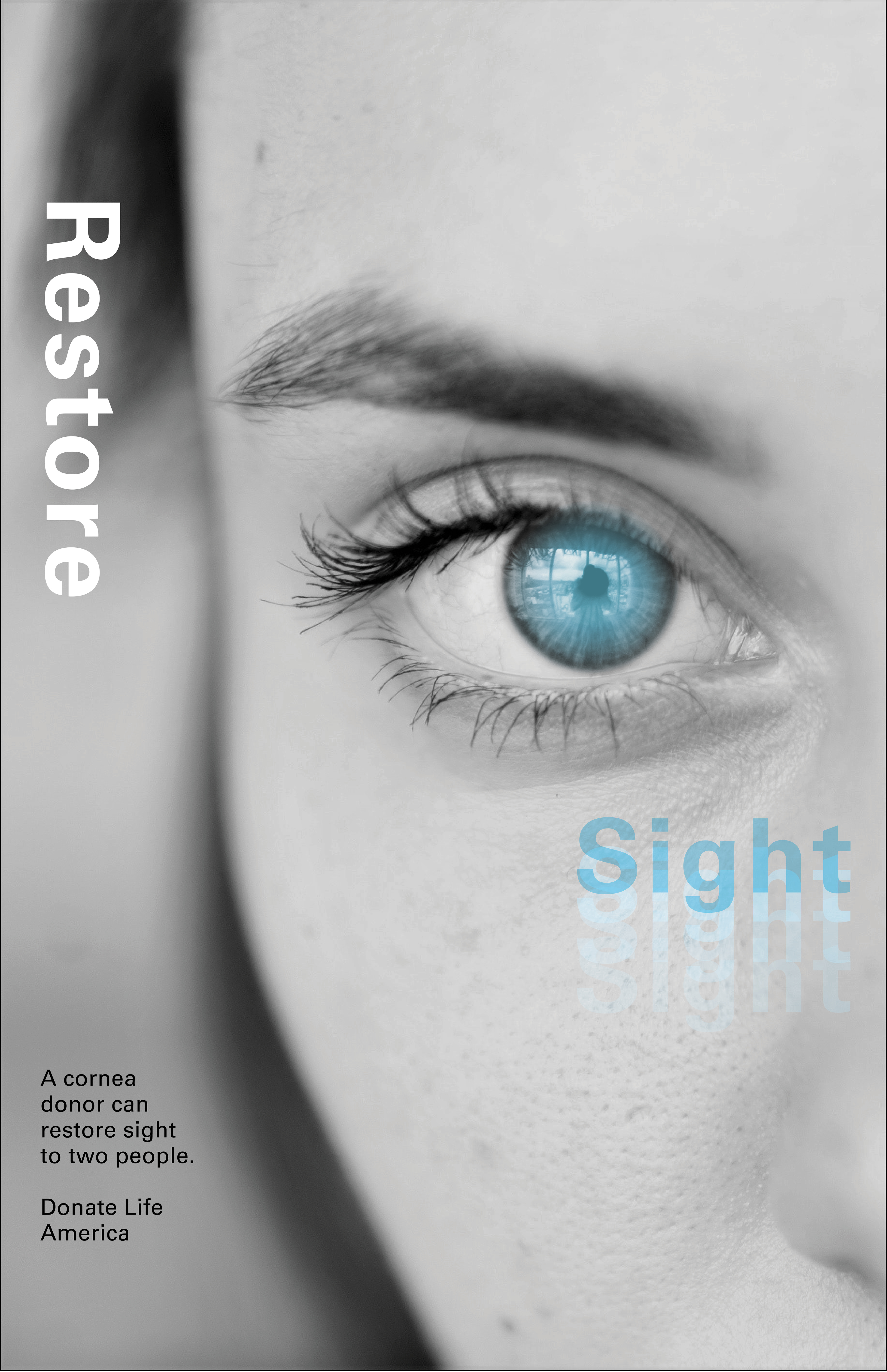
I picked general organs (the heart), tissue (the hand), and the cornea (the eye) as the three different types of donations to represent. I also tried to pick a color palate that was a balance of pinks and body and skin colors. Because the drawings are the focal point, I didn’t want to add too many other elements to the design.
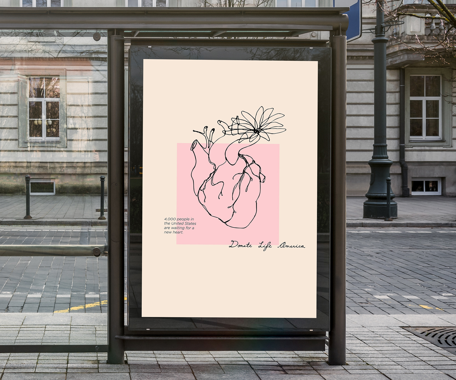
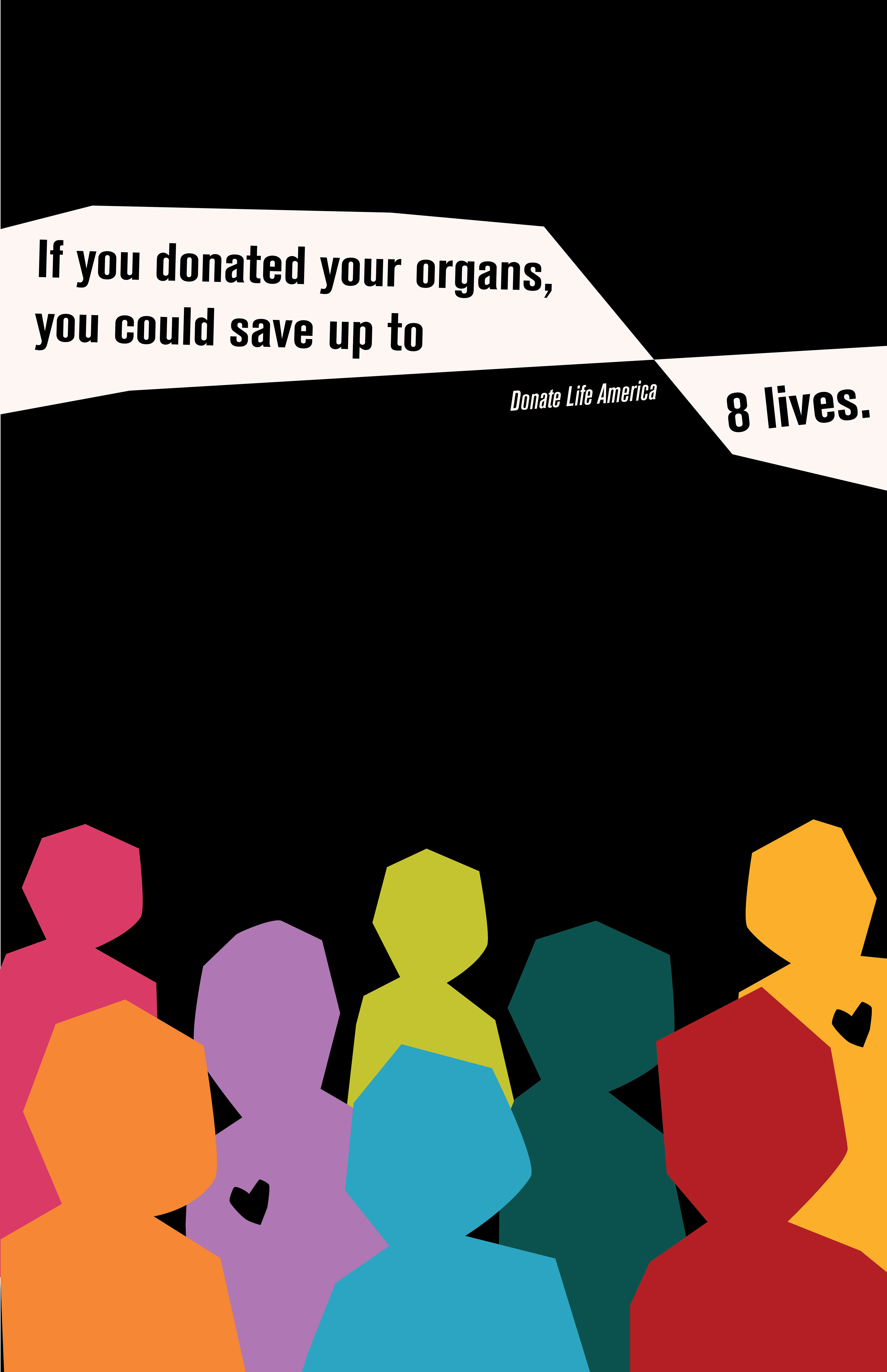
The final versions of these posters has text that bleeds from the square at important statistics that I wanted to highlight. I made the text more legible, and the drawing of the eyes more clear.
The end design has only five moving elements: the drawings, the square, the copy text, the Donate Life America logo, and the colors. I learned through creating this poster set that with such a simple layout, minor adjustments to any of these elements can make a huge impact on the overall design.