


process


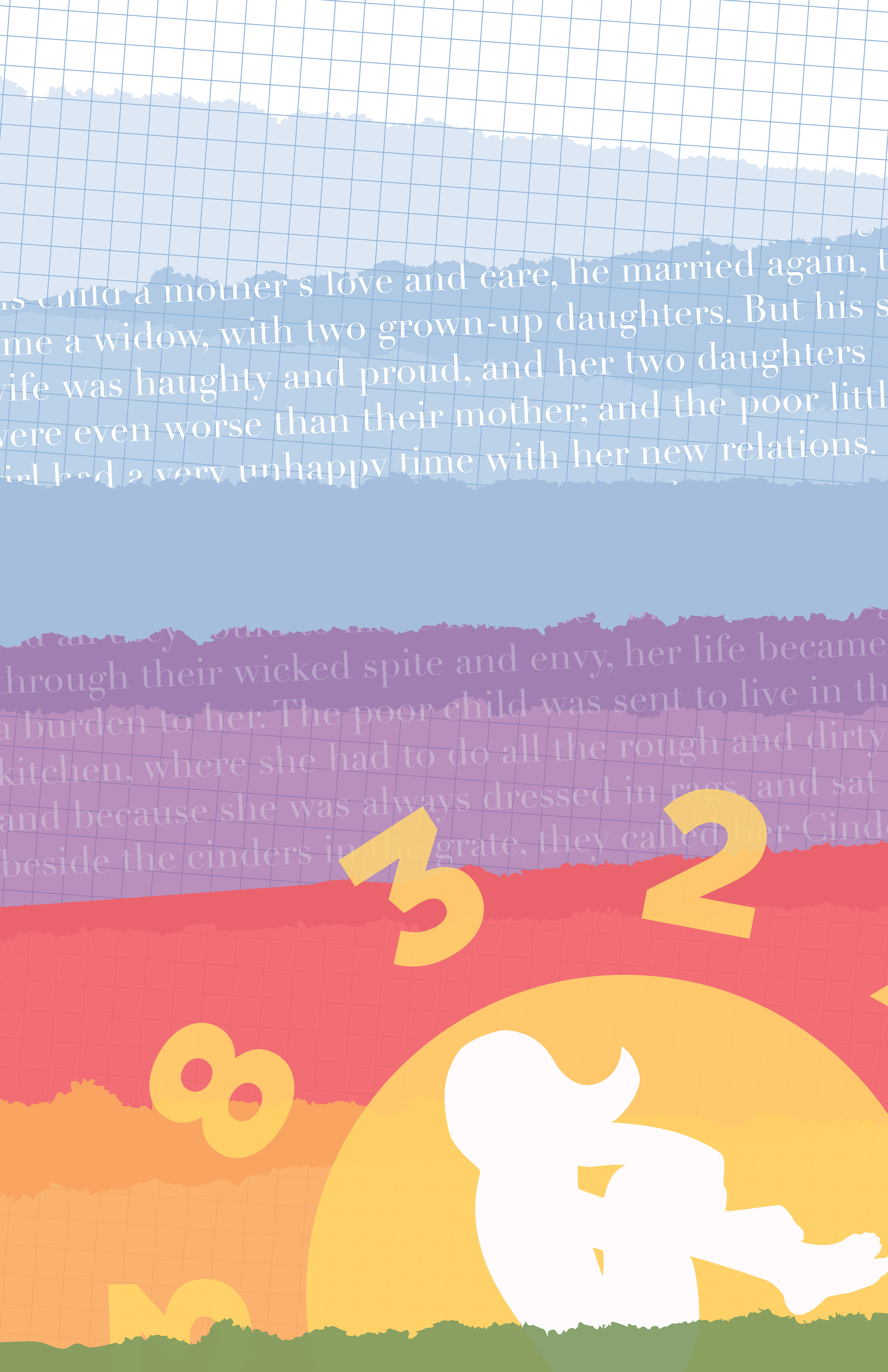
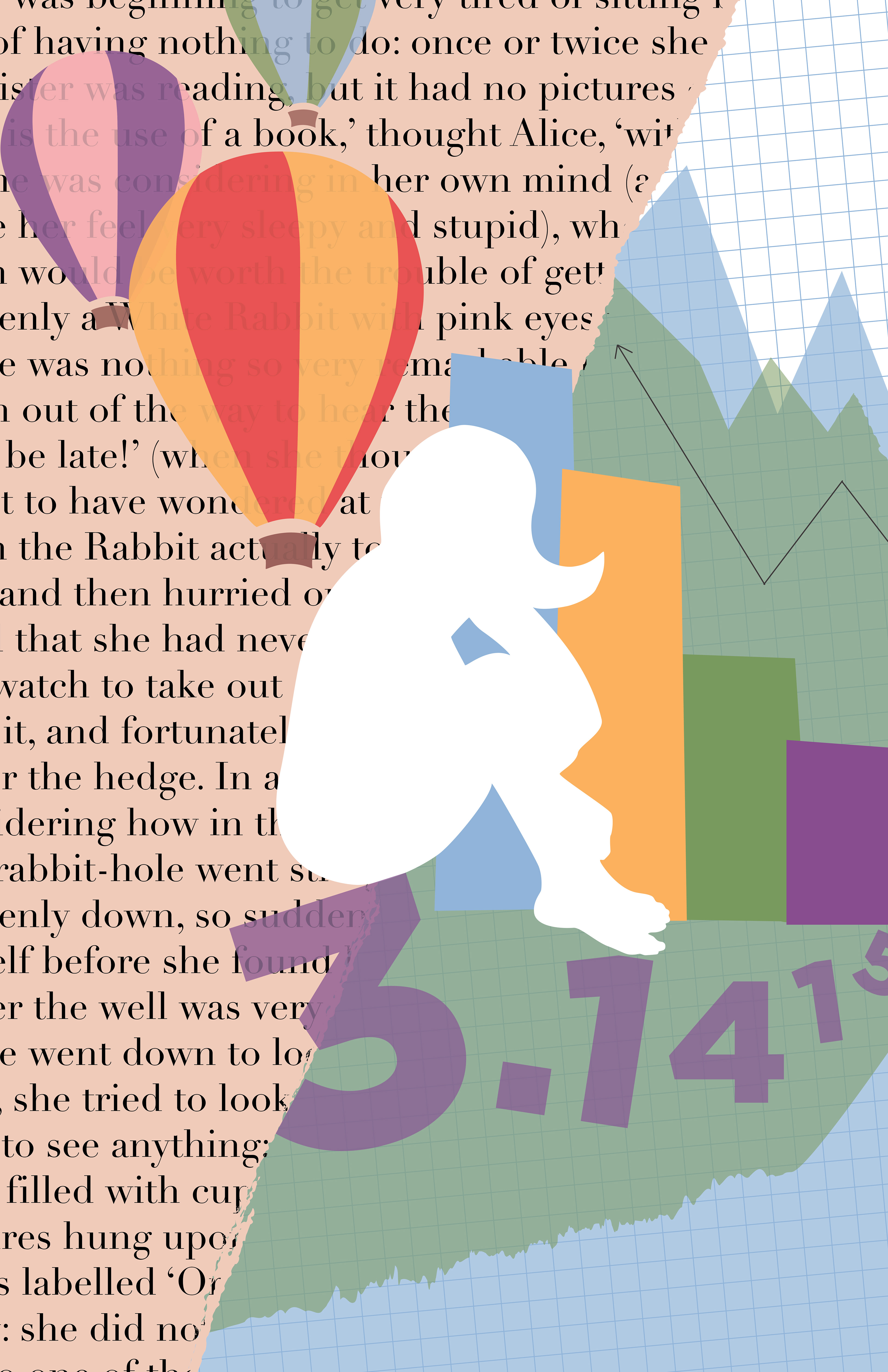
Displayed above are the first drafts of my posters. From the start, I knew I wanted to convey my playfulness and a sense of childhood wonder. The decision to use bright colors reminiscent of construction paper reflect that. However, I had trouble deciding what imagery to use that would still make these posters work together as a set.
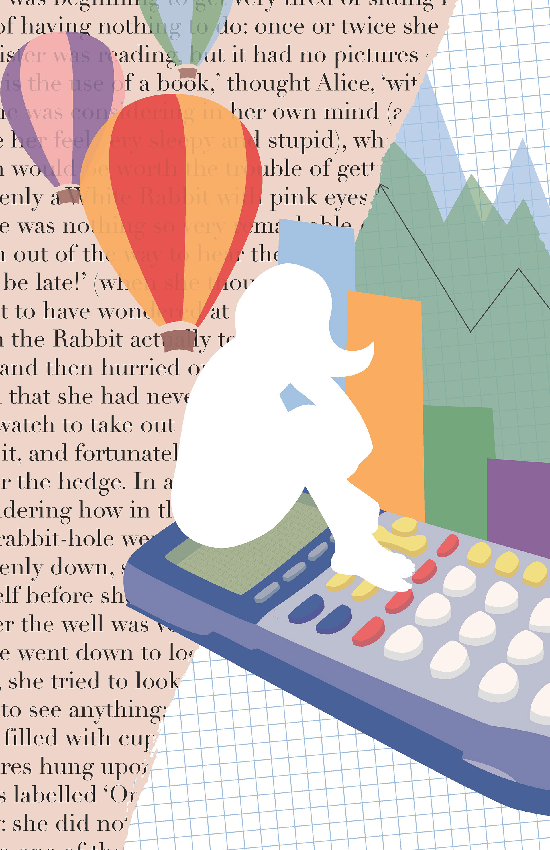
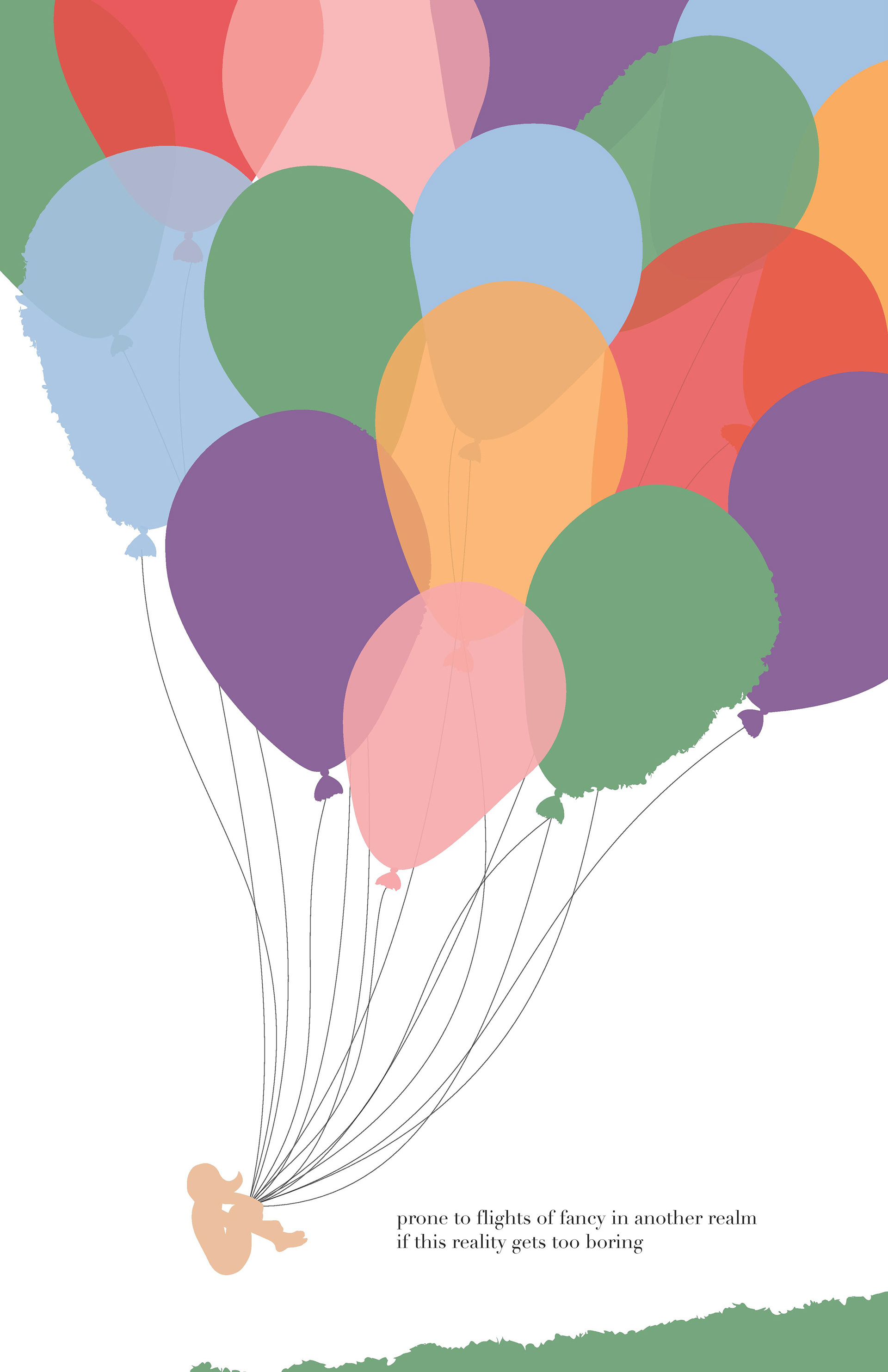
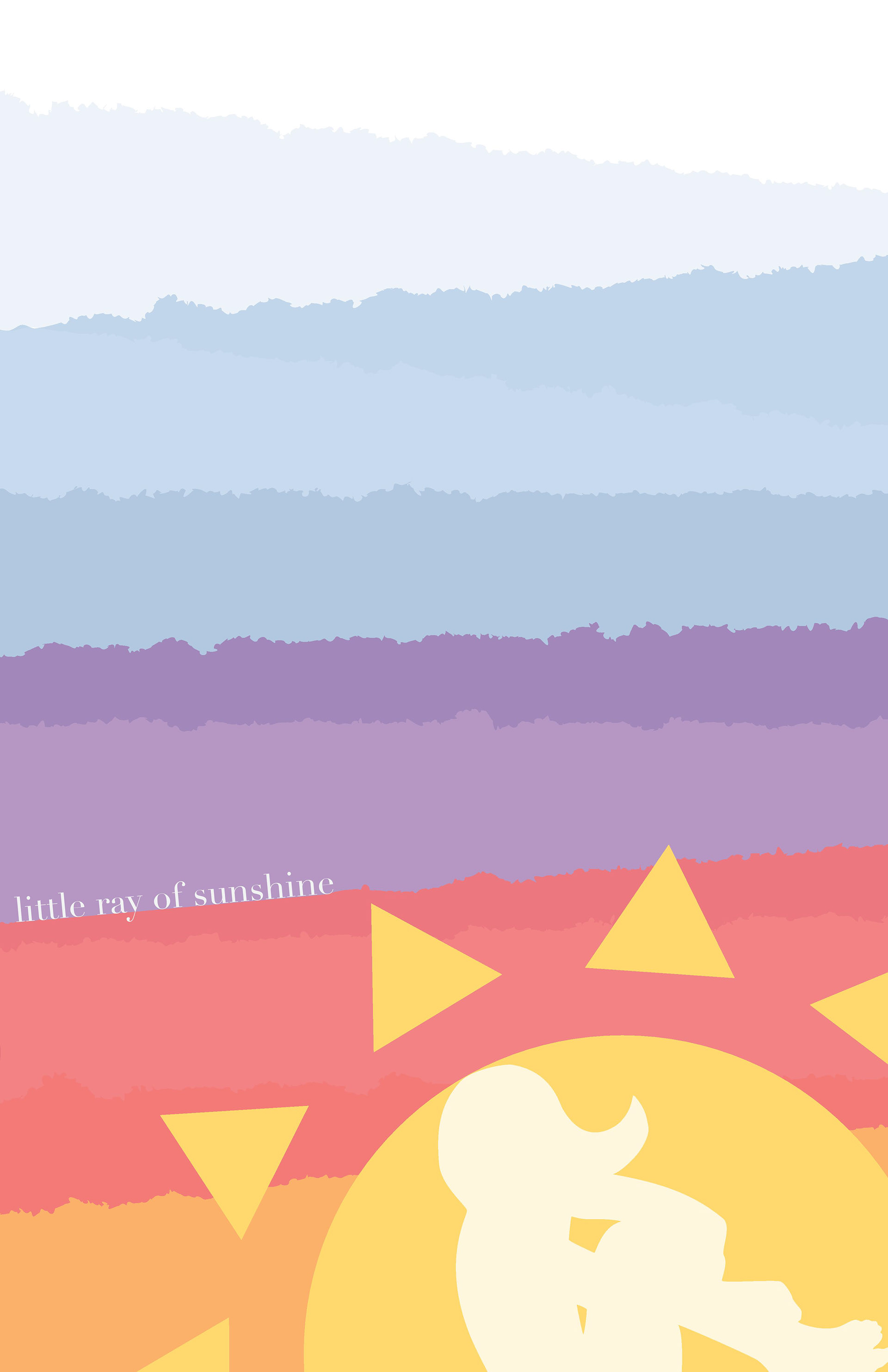
I’m equally analytical as I am creative. Originally I had an image of me sitting on a calculator, but the colors and shapes felt out of place. To solve the problem, I decided to use patterns, textures, and transparency to bring the pieces together. I consistently used a graph paper background, and extended pi to trail in the distance. I also brought in references to fairy tales and children’s stories (Alice in Wonderland, Jack and the Beanstalk, and Cinderella respectively). This added another visual tying element and layer of depth to each poster.