For this semester-long assignment, I was asked to design a visual campaign for a social cause of my choice. This campaign needed to have a persuasive message that could be displayed through a variety of mediums and spaces. First, I researched my cause. I considered my target audience—who this cause would appeal to, and why. Then, I created a cohesive graphic system that would convey this message in a compelling way.


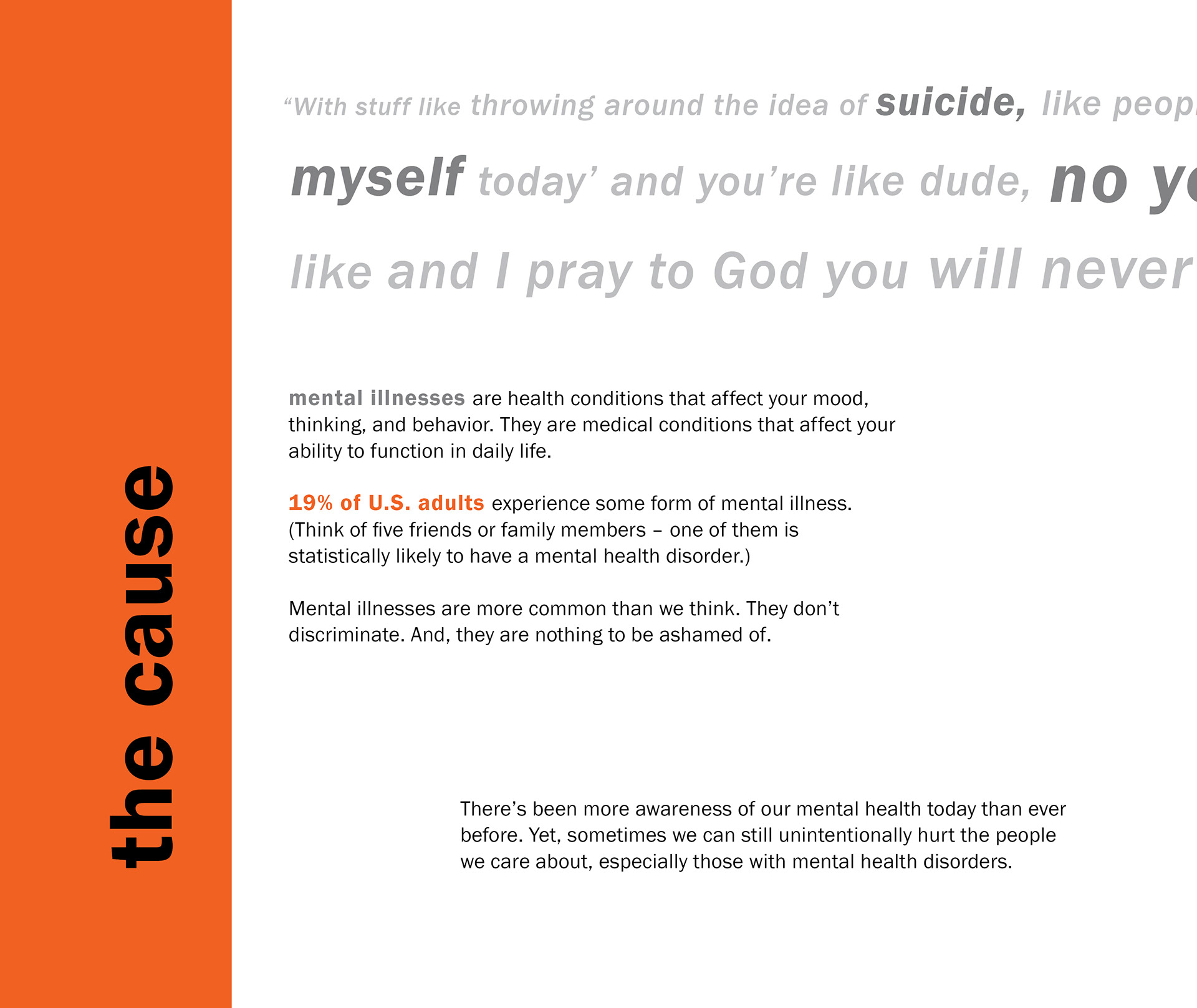
Almost 1 out of 5 US adults experience some form of mental illness. Struggles with mental health have affected those who are very close to me. Although we do acknowledge the value of mental wellbeing far more than we have in the past, sometimes innocent actions or words can still sting.
I chose to create a campaign to raise awareness of the everyday slights that people with mental health disorders face. I wanted to create a community where people could share what bothered them. I also wanted to motivate others to be more mindful of how they spoke about mental health.
My goal isn't to police what language people should or shouldn't be allowed to use for "political correctness". Instead, this campaign is meant to bring to light examples of dialogue that can potentially be upsetting. It gives weight to how much hurt innocuous phrases can cause. It also lets people with mental illnesses know that being upset is a valid reaction, because others may feel the same way.
COLLATERAL BOOK
Pages sized at 9.5 x 8 in.
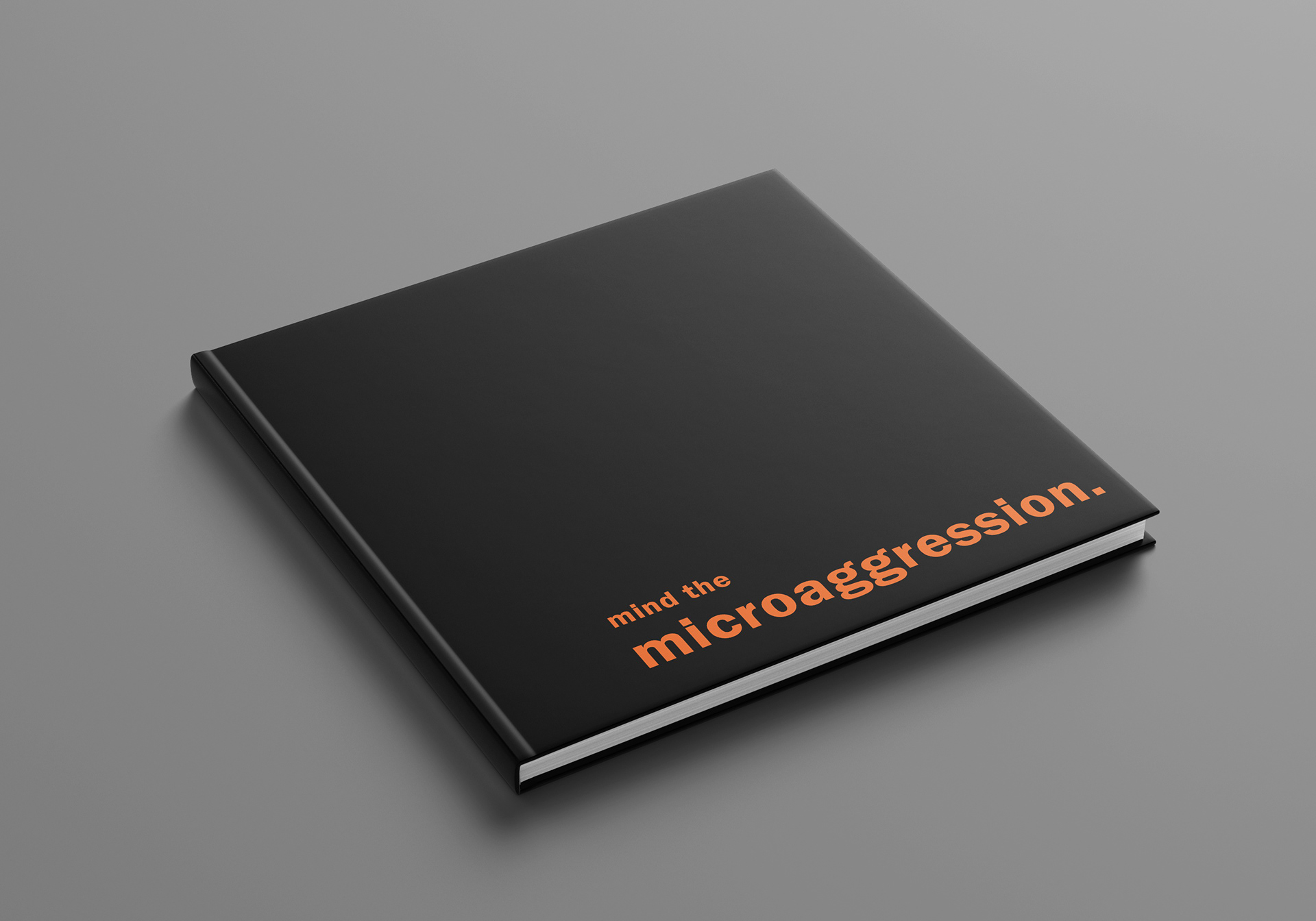
The collateral book displayed above introduces the campaign and explains the targeting and branding in detail. Below I include some pages from this book.
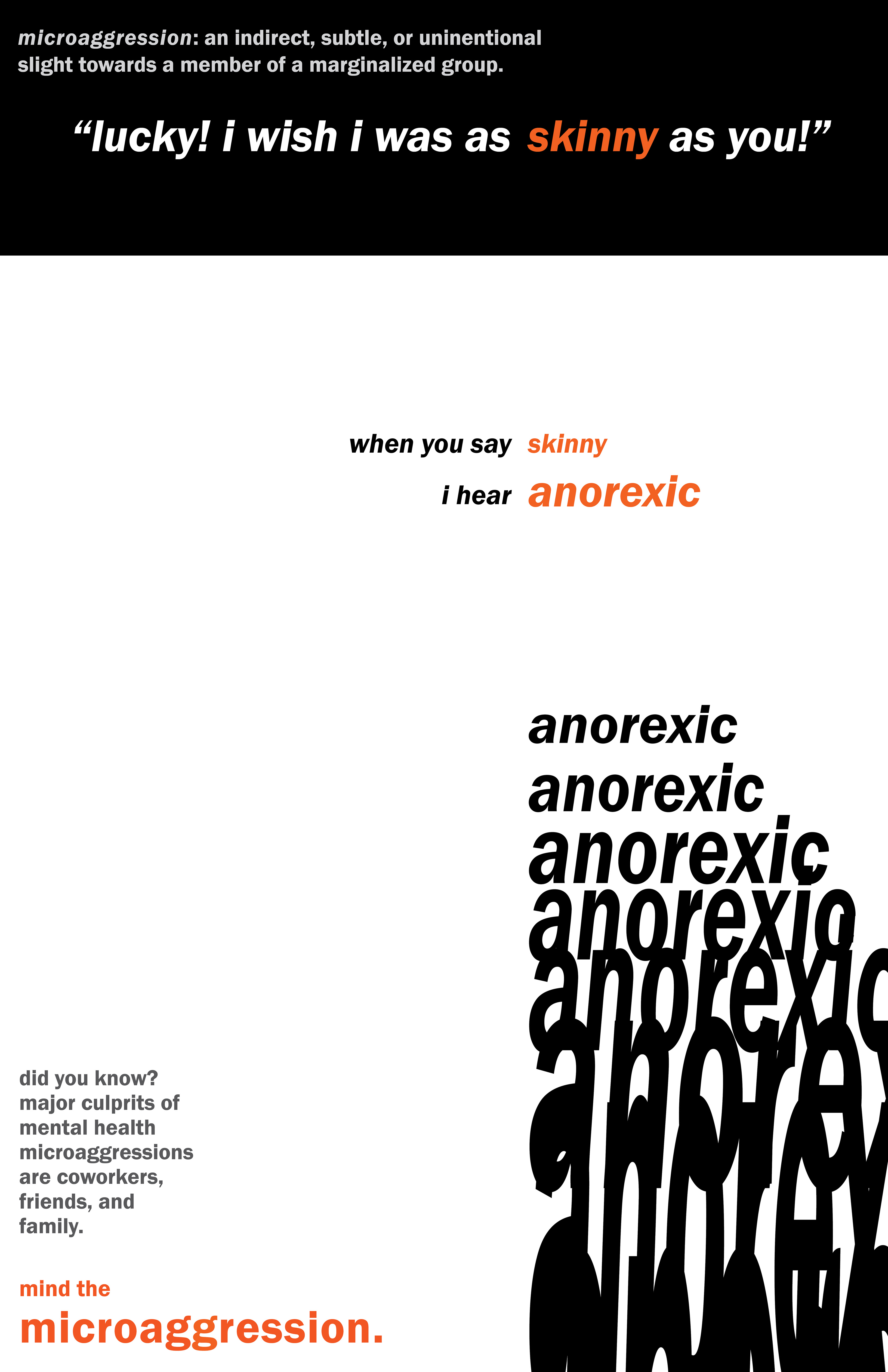
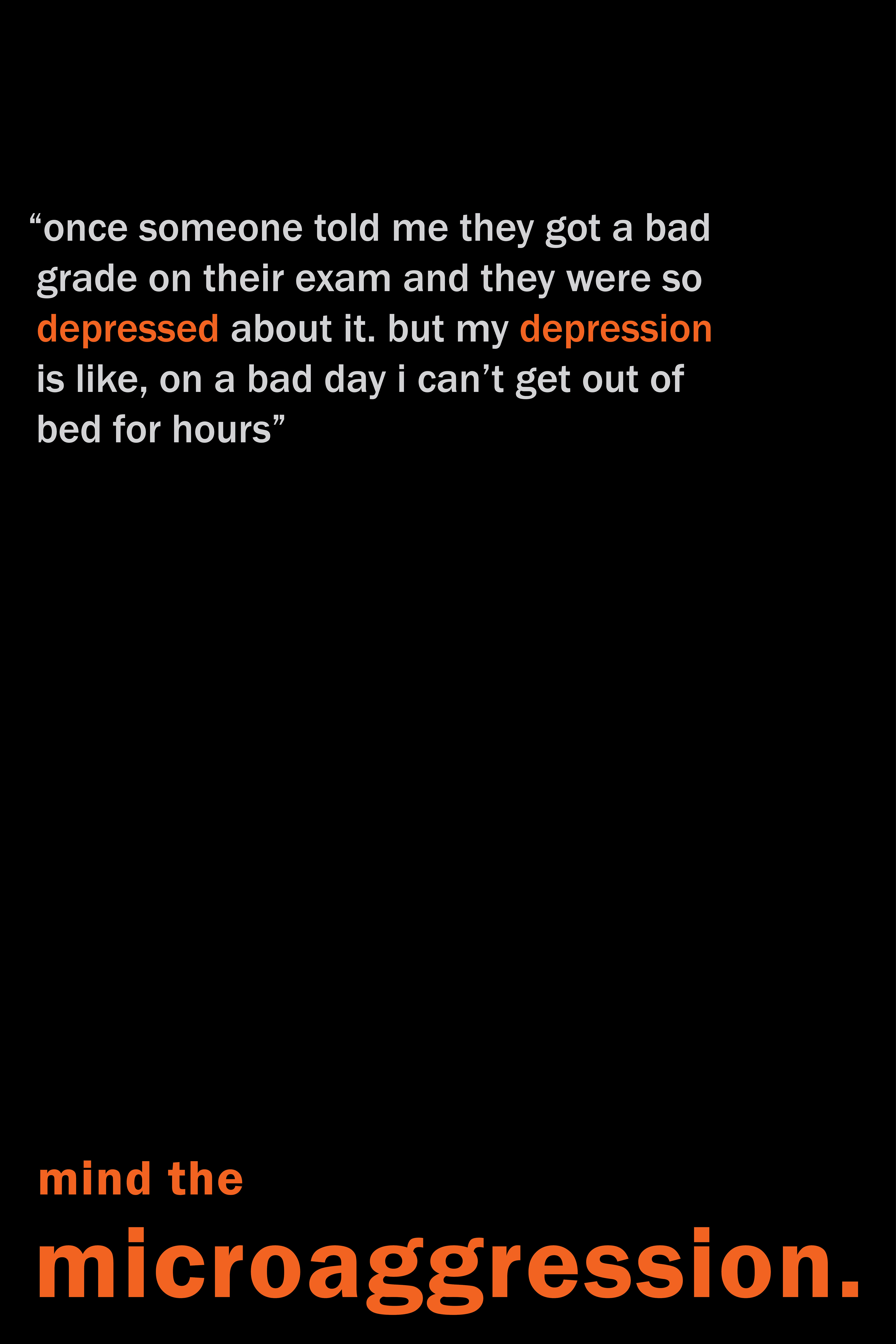
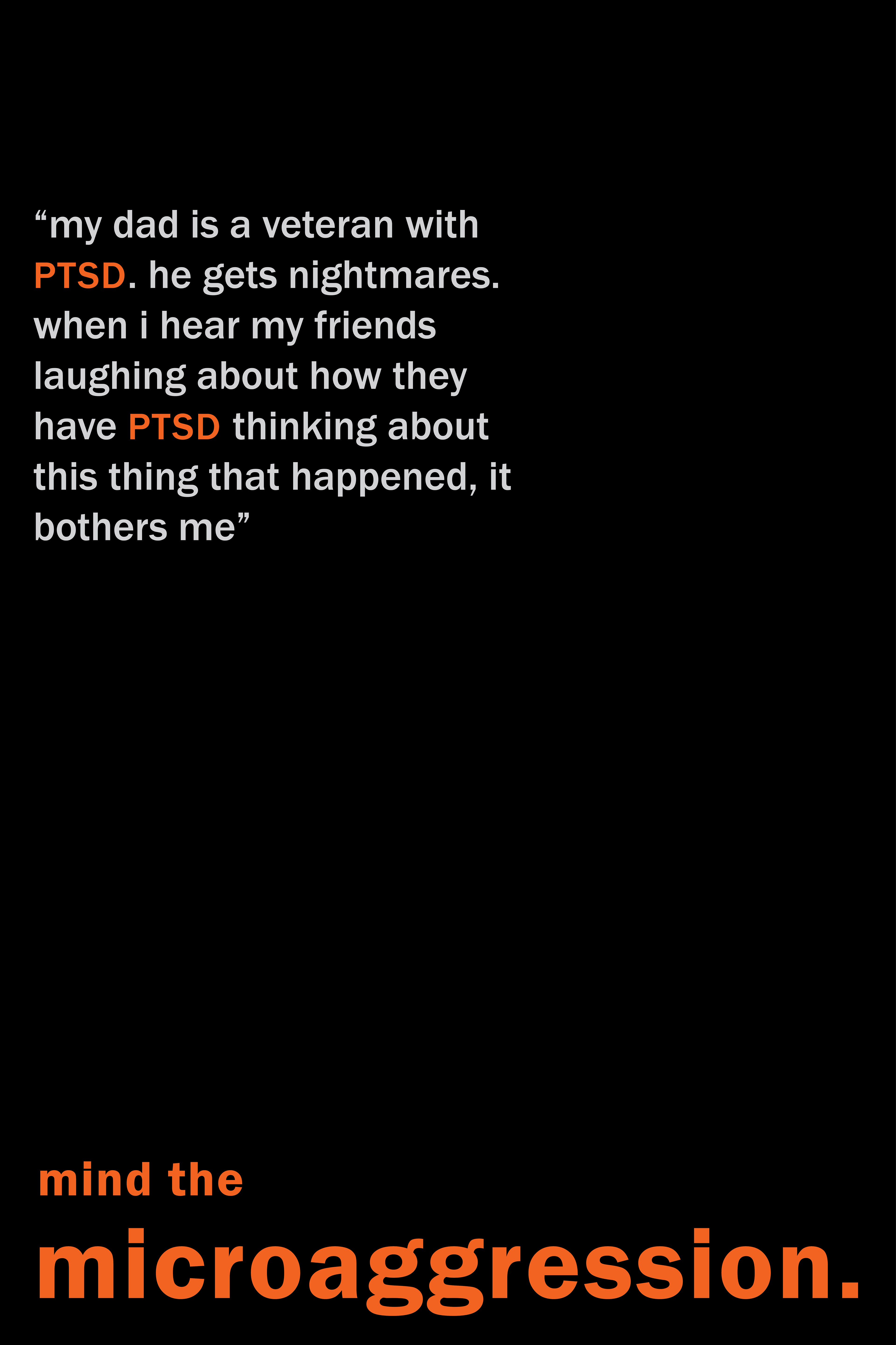
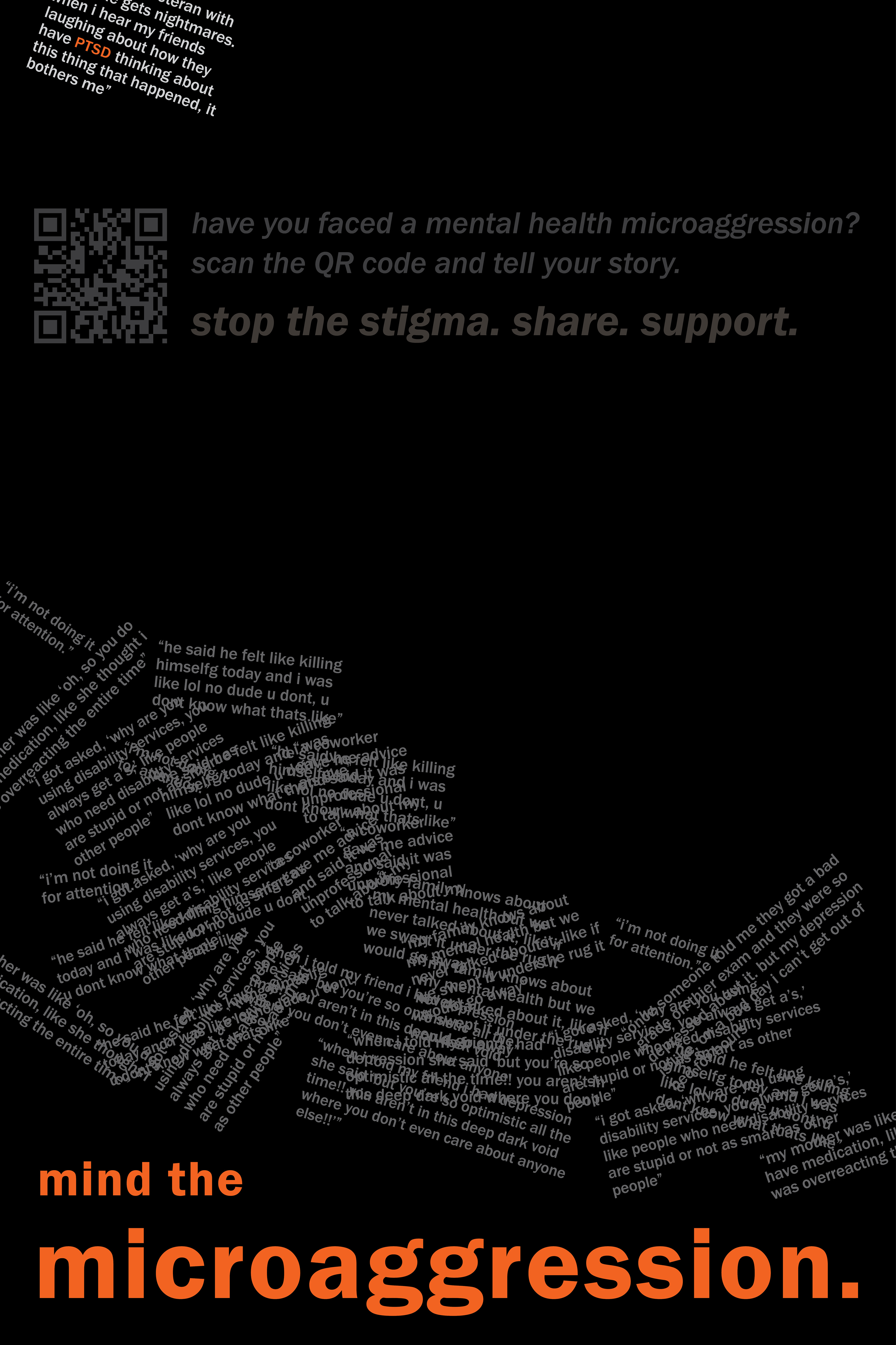
My first decision was to make this campaign entirely typographic. By design, there are no pictures or imagery. Everything around this social cause revolves around language, and I wanted the focus solely to be on what was being said, not who was saying it.
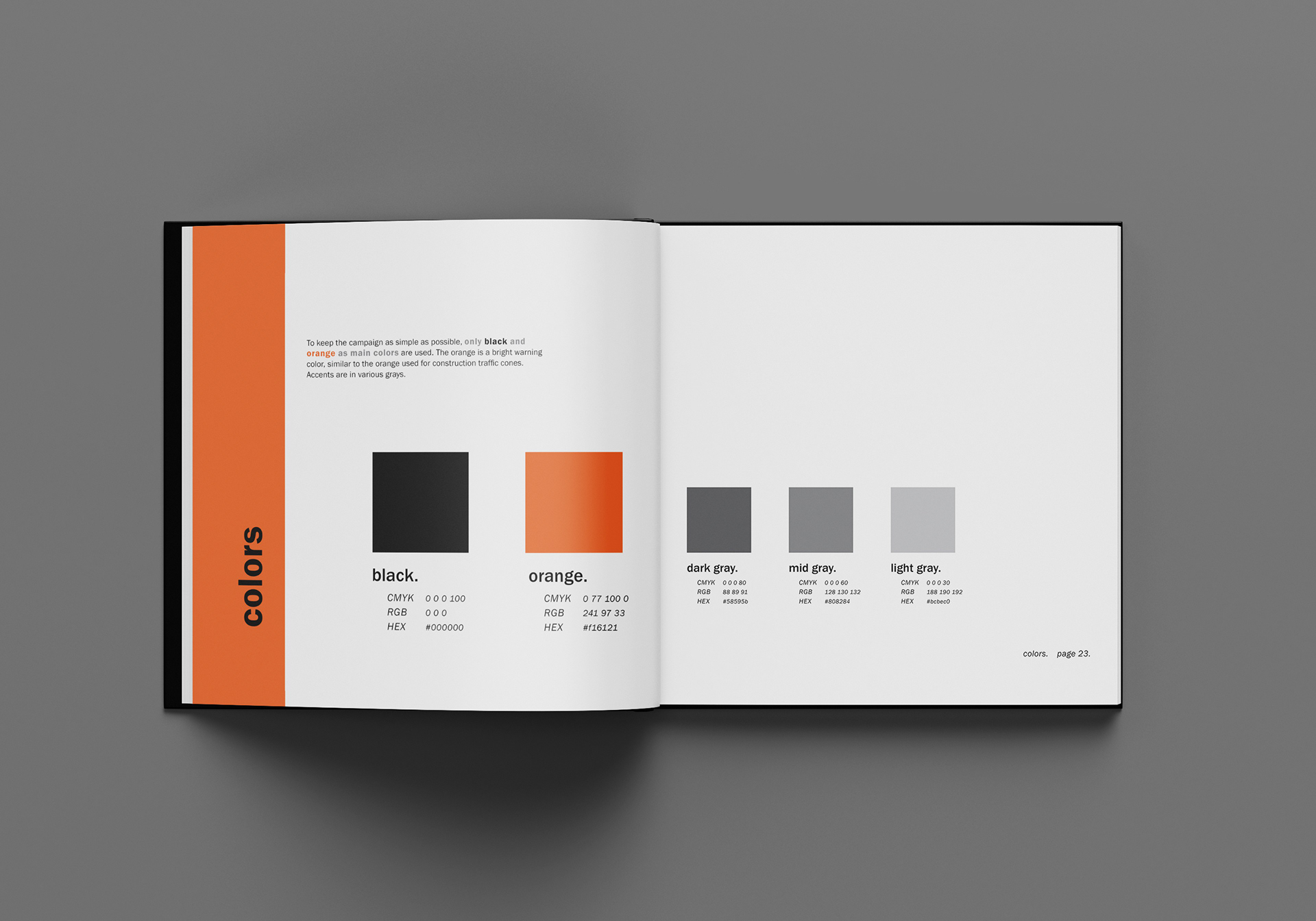


For this same reason, I was minimalistic. I only use two weights of the Franklin Gothic typeface. I also only use one color—orange acts as a bright warning hue, like a traffic cone. The rest of the campaign is accented with black and grays.
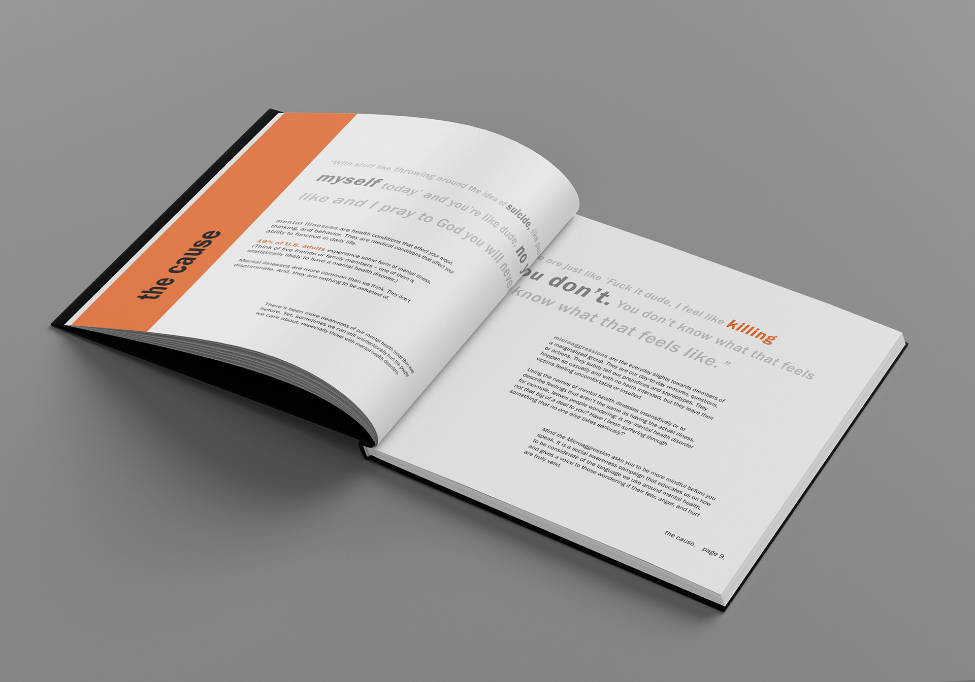
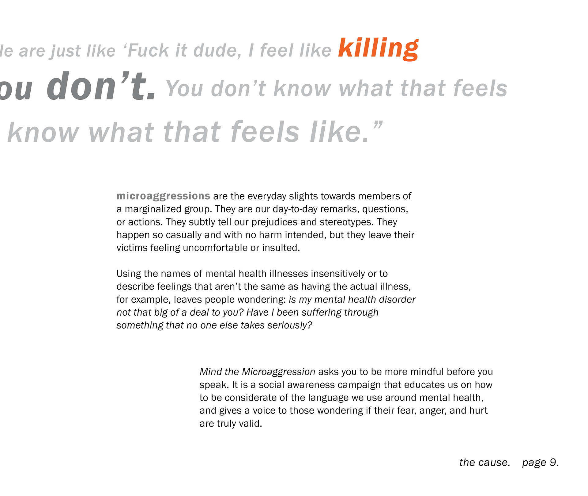
I also wanted to have real quotes as the main element of my campaign. I felt that directly hearing what people said and others' reactions would be the most impactful. I pulled these quotes straight from qualitative studies I found through my research. These studies examined how microaggressions impact people's self-esteem and emotions.
3d series


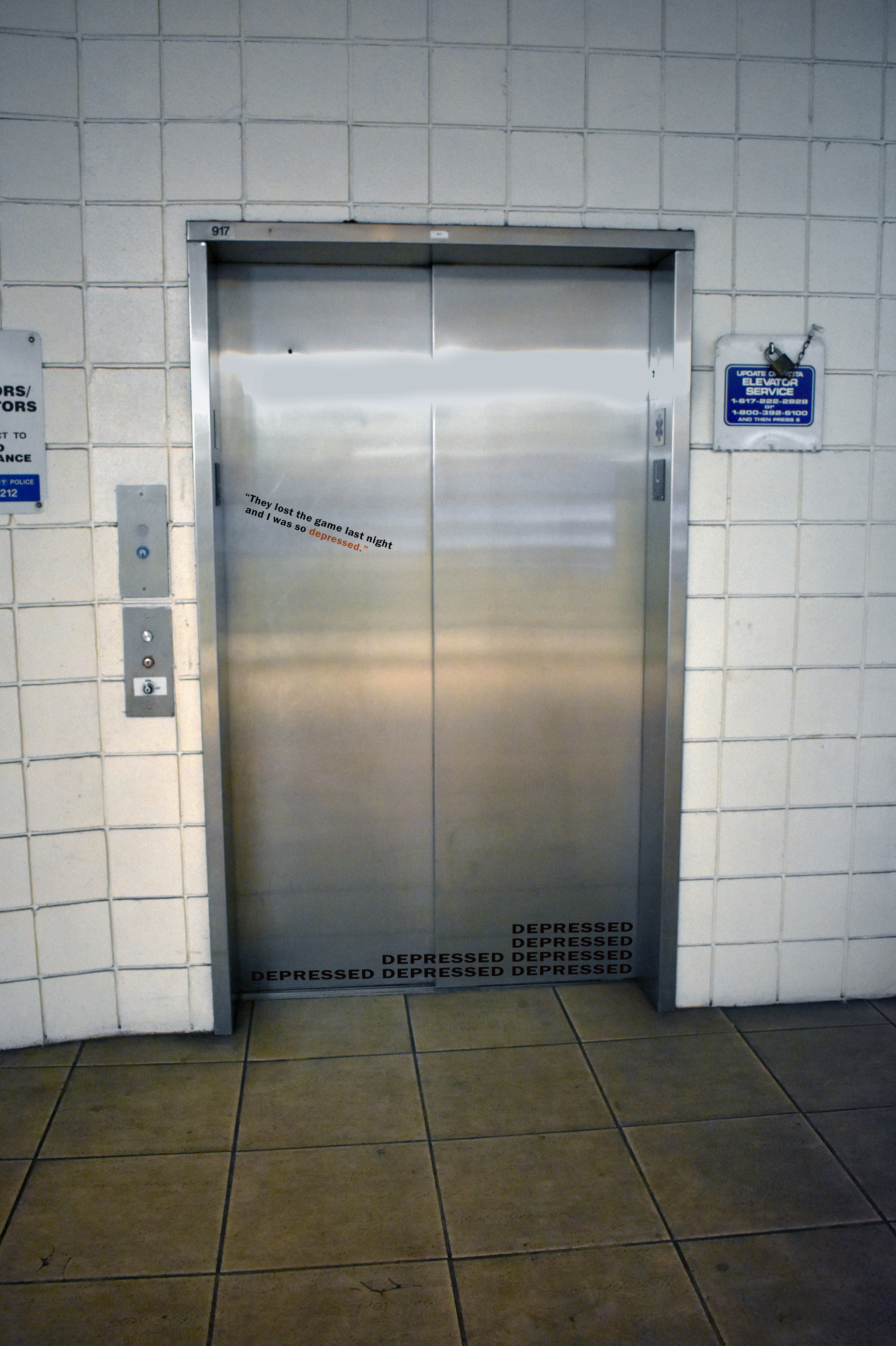
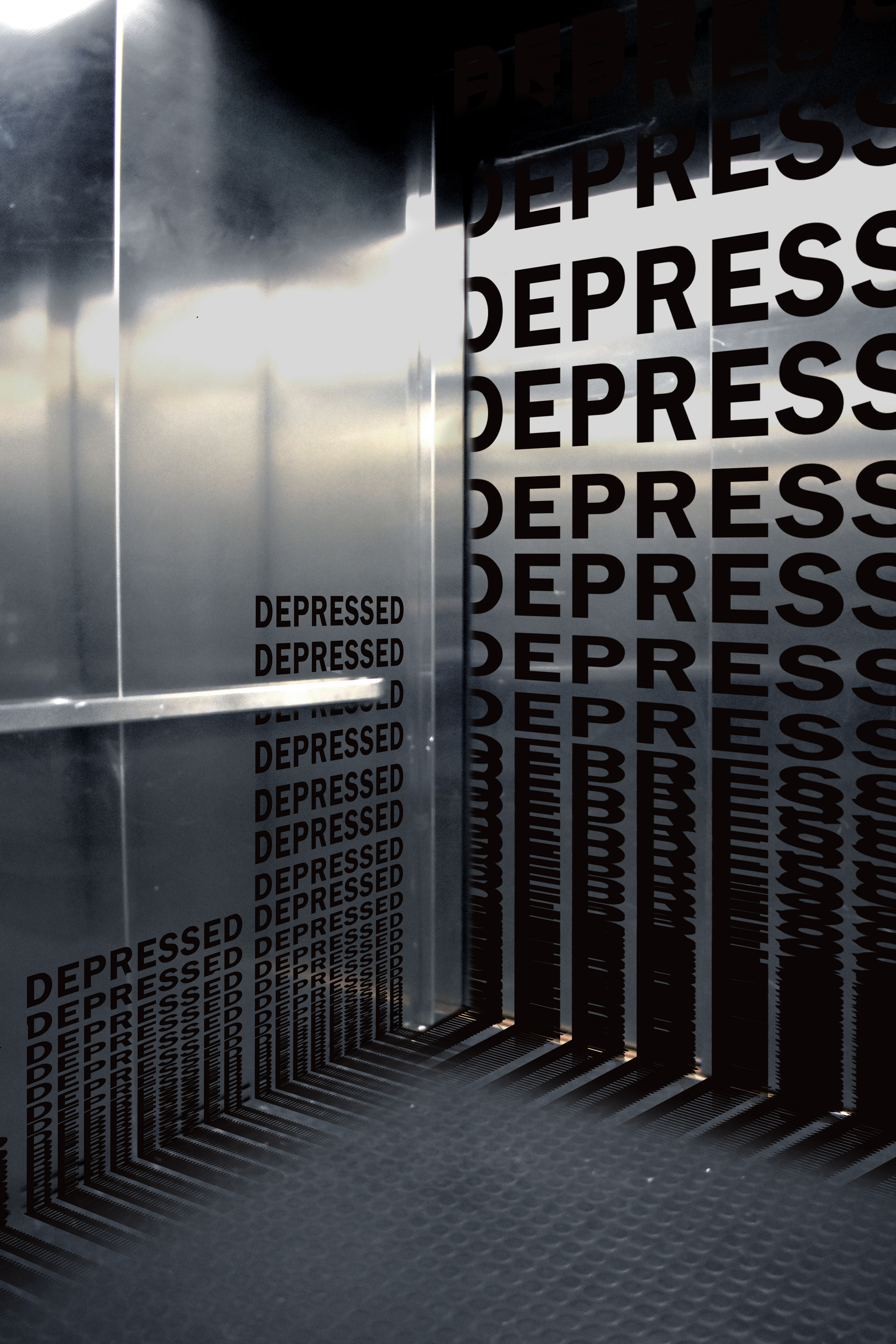
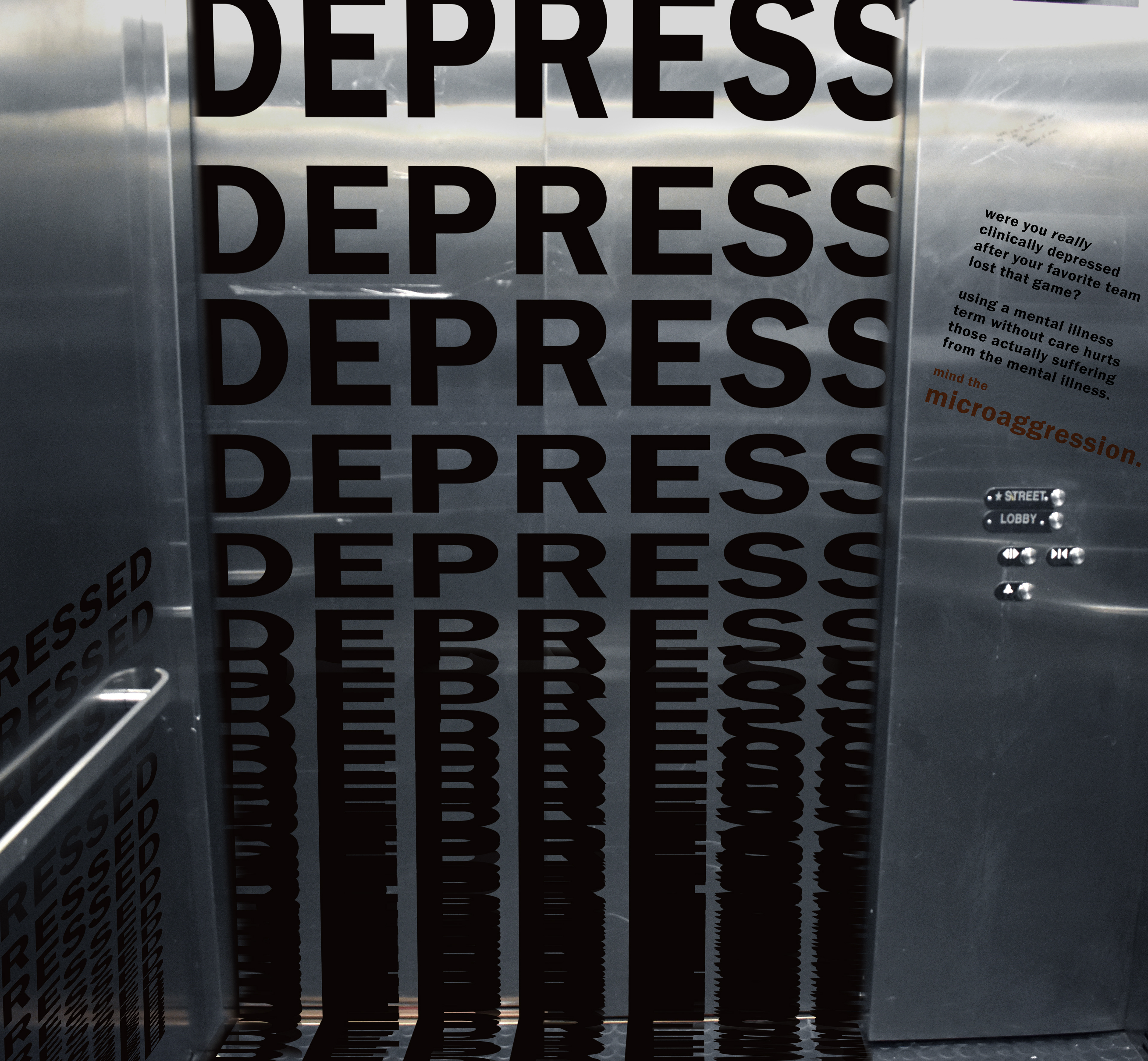
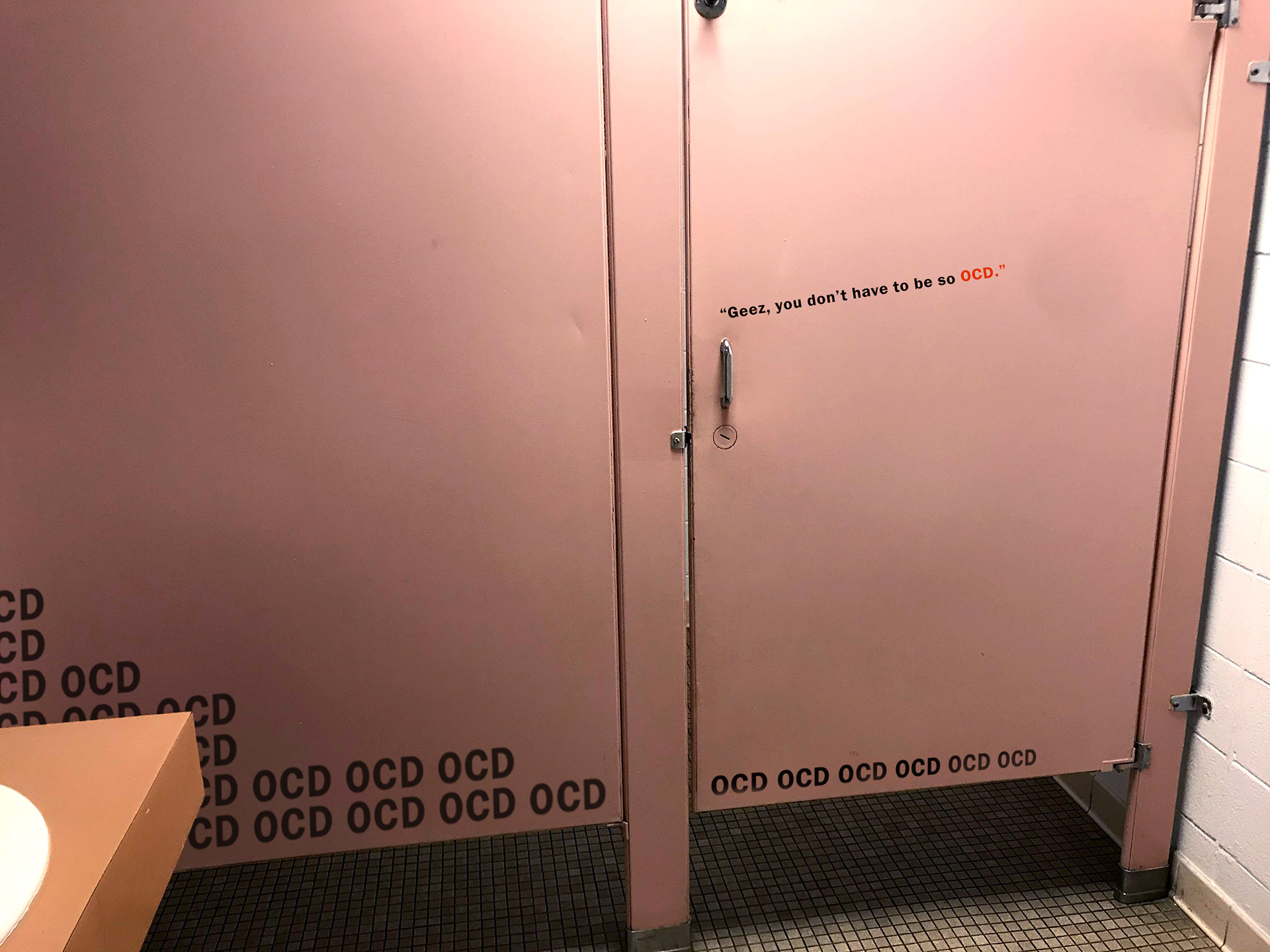
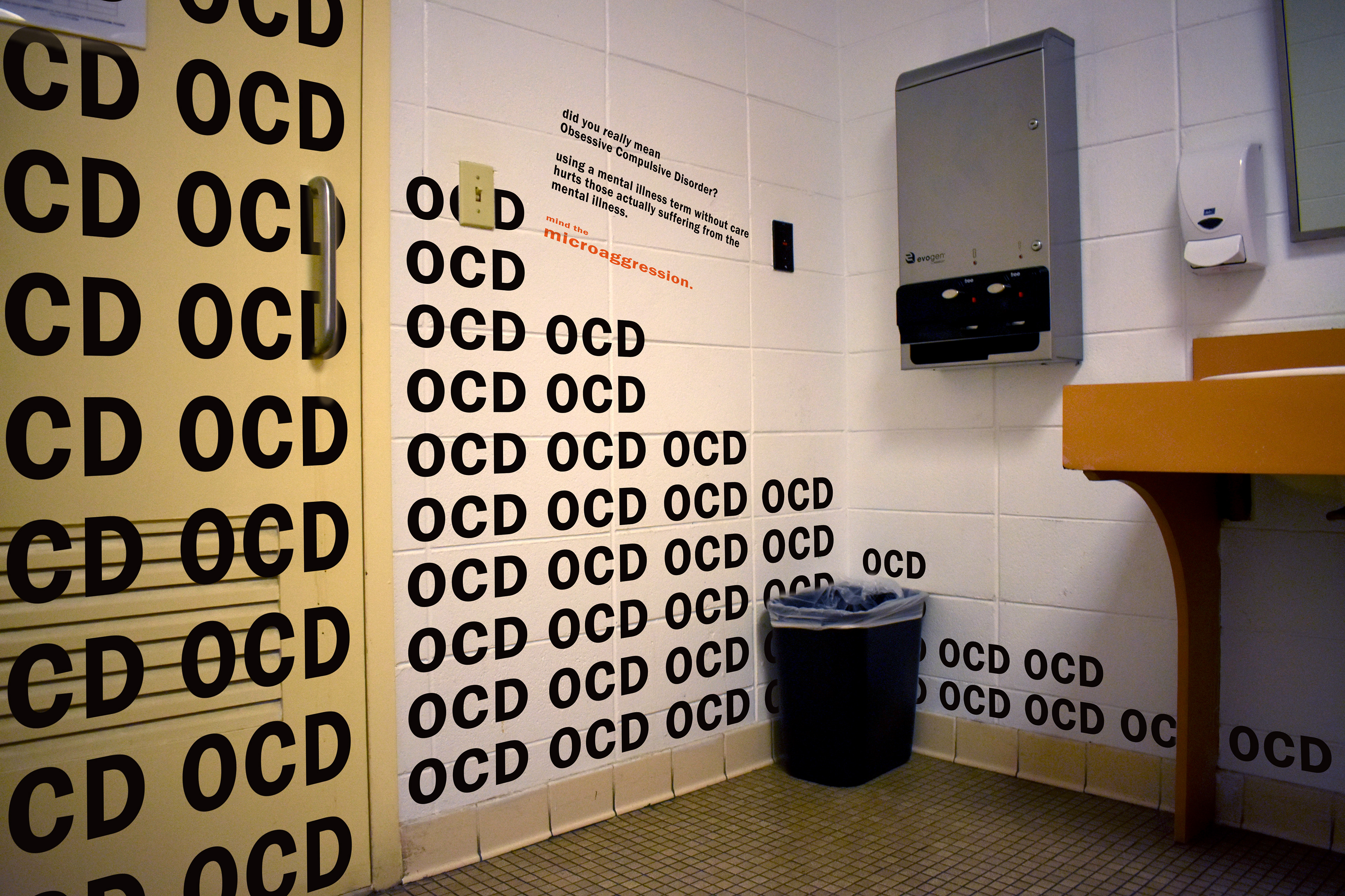
The 3D implementation of my campaign takes advantage of small, ordinary spaces, like elevators and public bathrooms. These unseeming spaces are part of everyday life, just like how microaggressions happen day-to-day.
There also is typically a sequence to how a person navigates these spaces. (For example, usually a person first waits in front of an elevator, enters when the doors open, turns around to press the button, waits for the elevator to move, and finally leaves through the door they came through—always in that order.) I thought a lot about this order when I was designing, and took advantage of it to fully show the progression of how little words can add up.
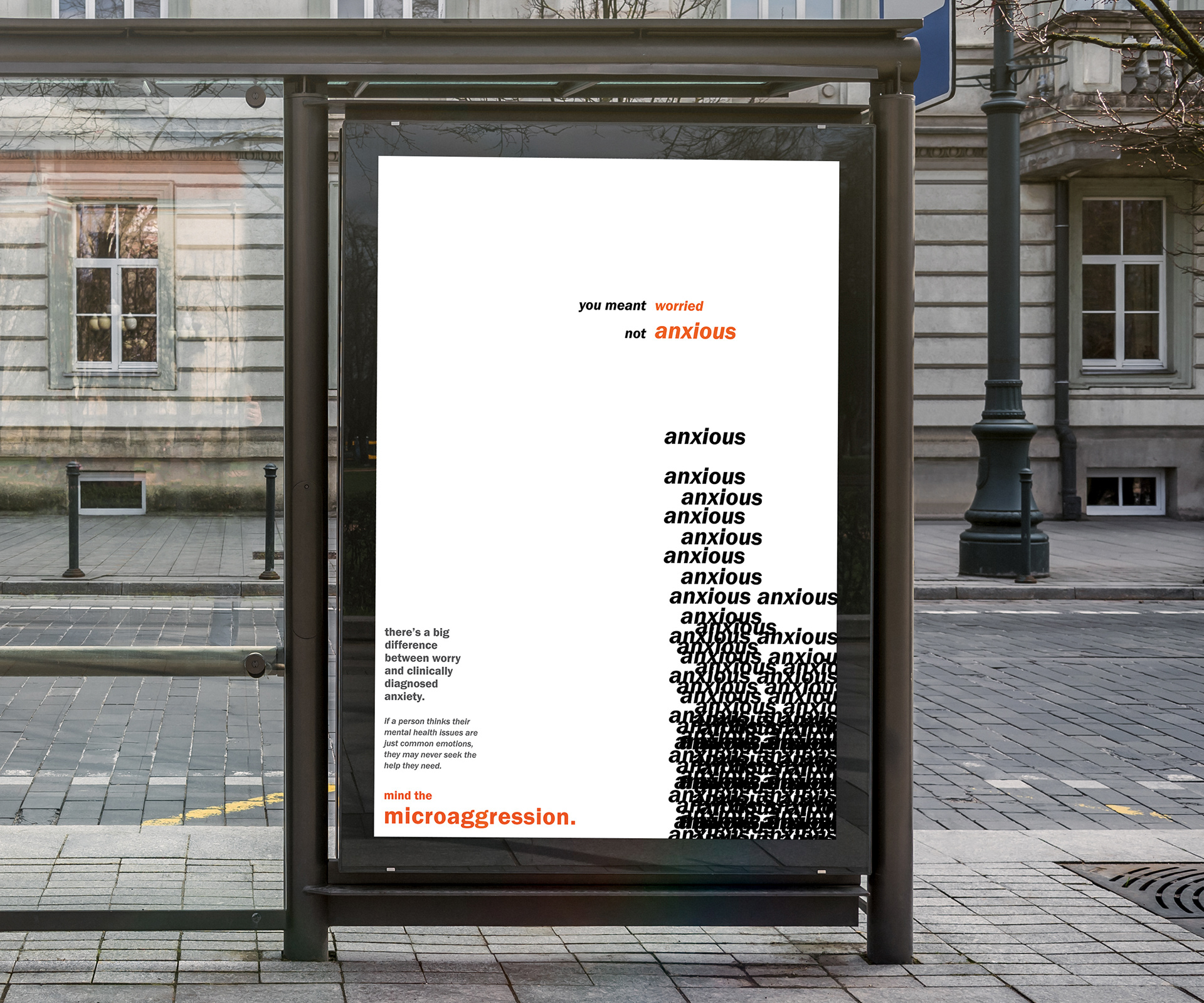
2D SERIES
Posters sized 11 x 17 in. (tabloid size).
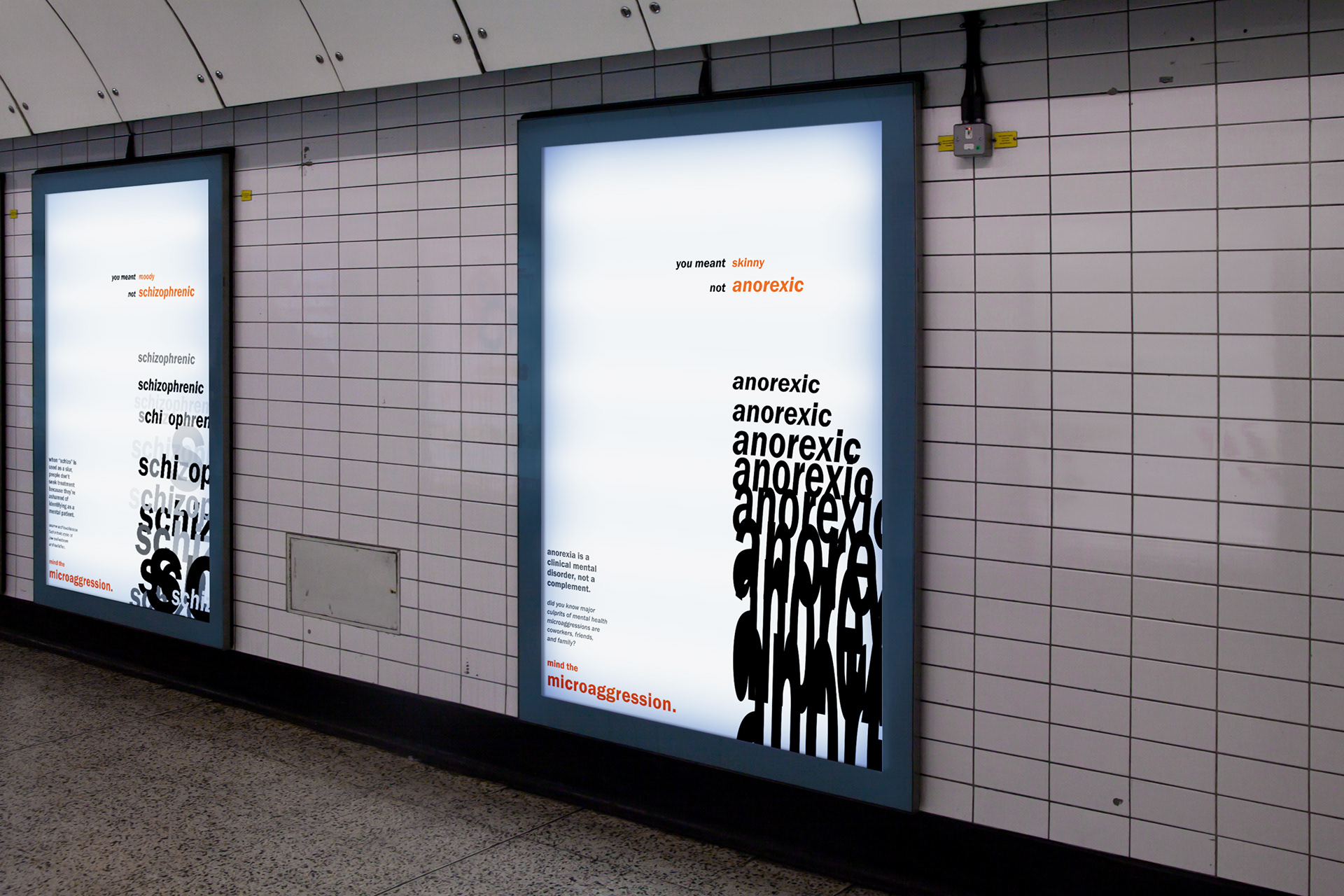
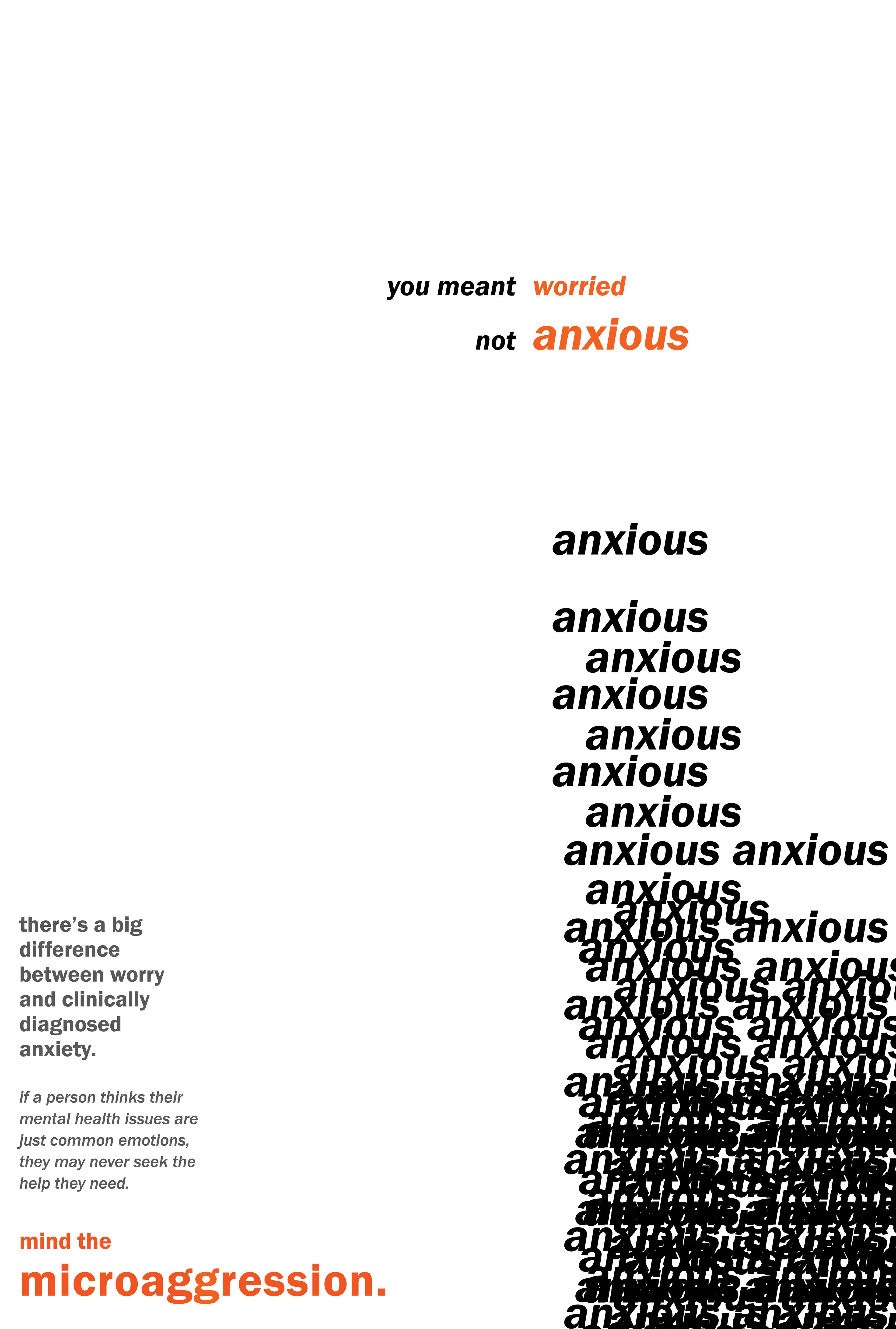

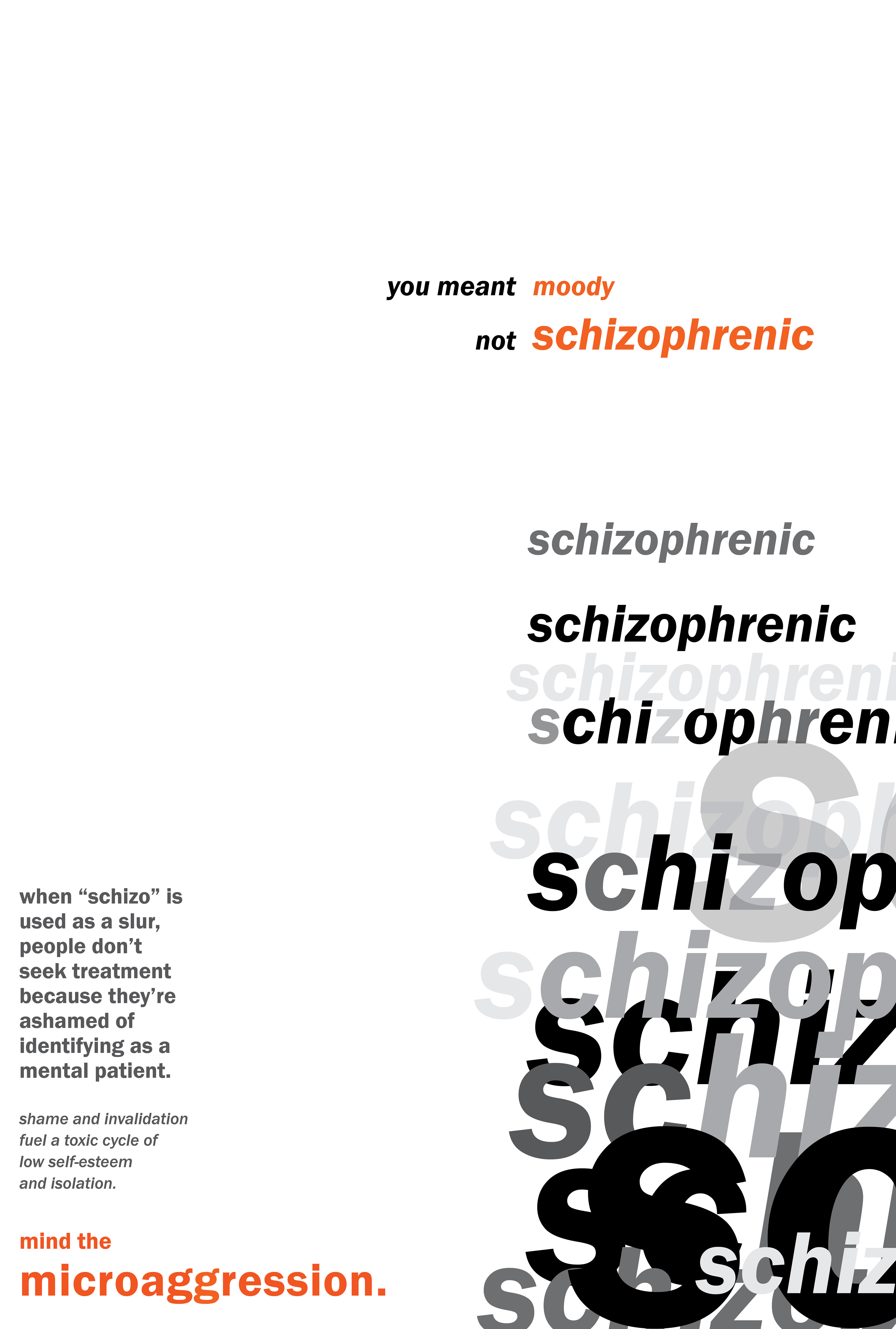
The 2D implementation of my campaign was a poster series meant for city billboards and public transportation spaces. Again, I wanted my typography to show the visceral emotion behind the mental illnesses being addressed.
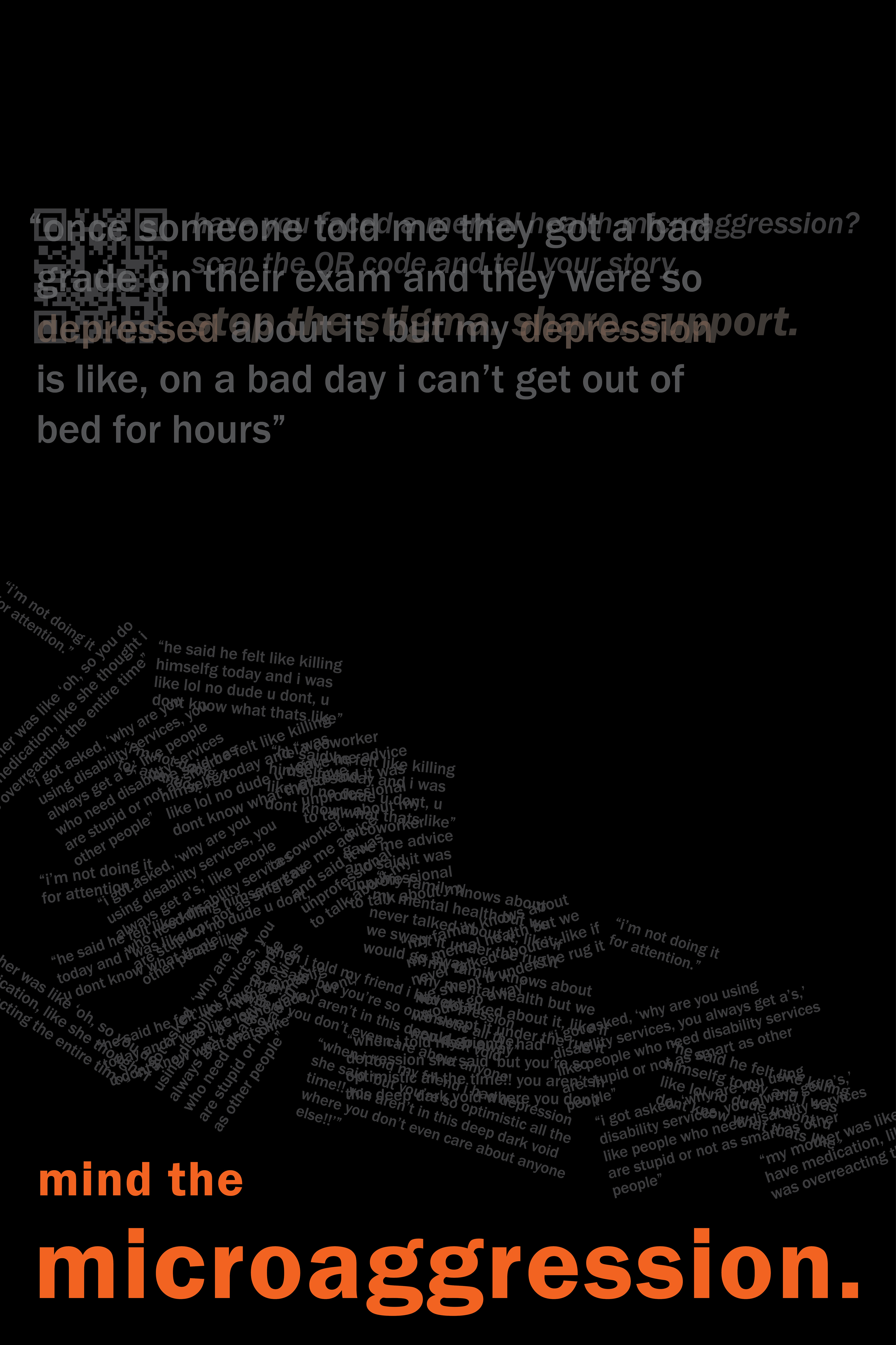
Displayed above is a first draft of one poster, where you can see that the language has changed significantly. The biggest challenge here actually wasn't the pure graphic design, but how I introduced my ideas. I got feedback that my original wording was hard to understand. This made me realize I overestimated the background knowledge of my target audience, and I worked at rewriting the copy to make it more straightforward.
screen series / website
Lastly, I wanted a piece of this campaign to be interactive with the community. To do this, I decided on having a website that would work together with screens shown on digital billboards within a city.
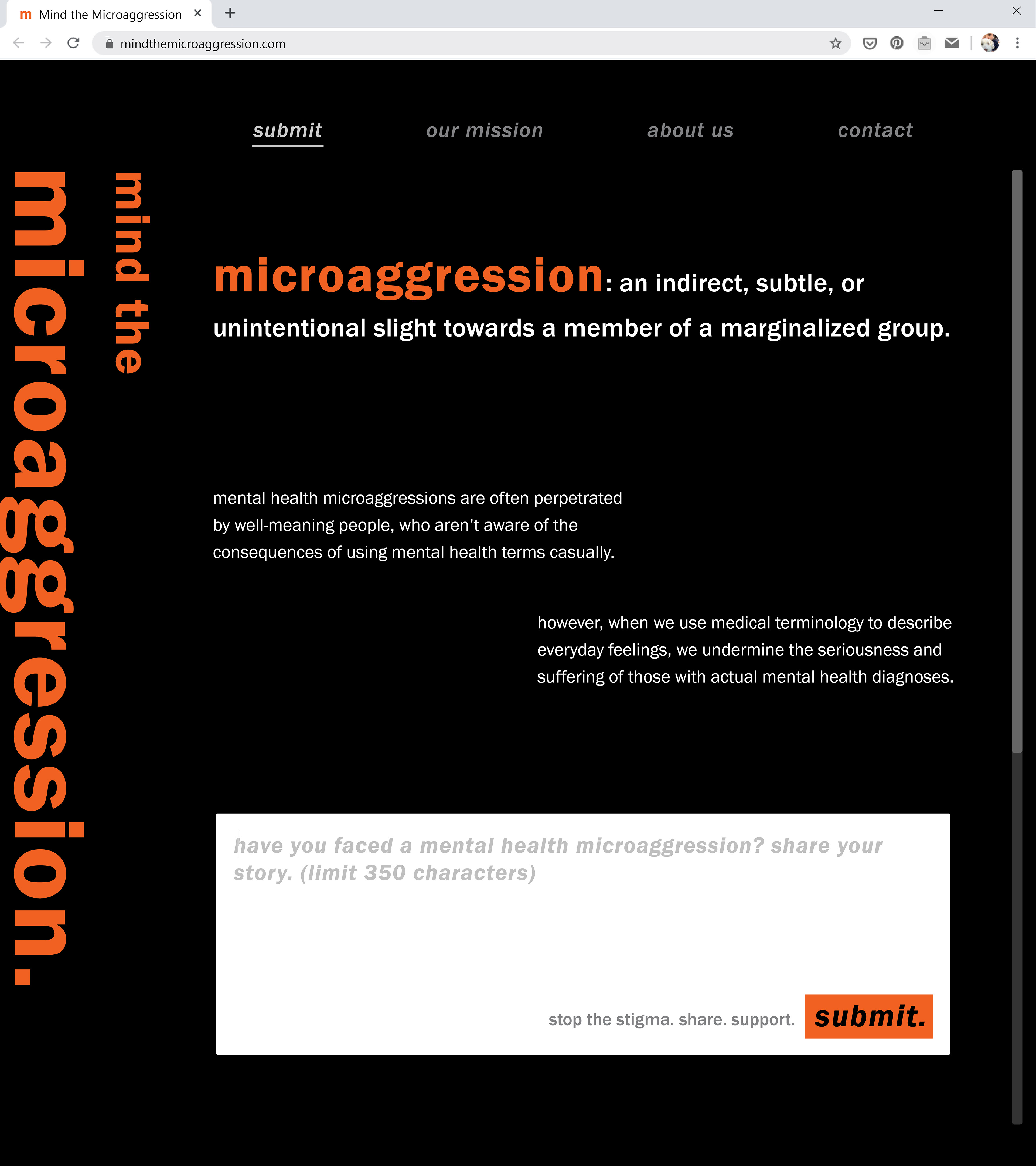
Displayed above is a mockup of the hypothetical Mind the Microaggression website. First, a person would access the website by scanning a QR code they saw on one of the digital billboards. Here, they would get more context about the campaign. They could also choose to share a microaggression they've encountered and how it made them feel in the anonymous submission box.

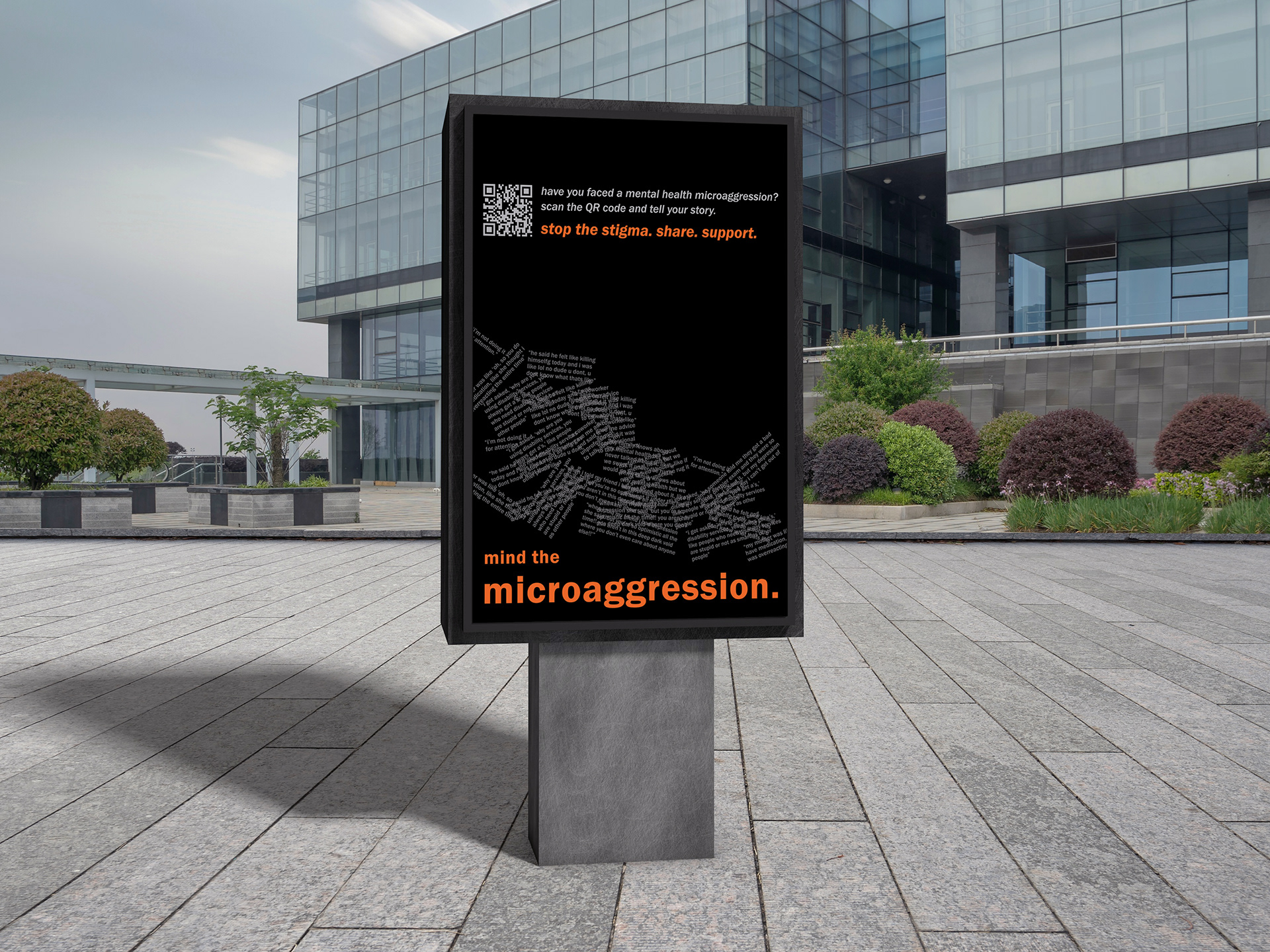


Next, these series of images are a static representation for how the screen animation would progress. A person sees what they just submitted on the digital billboard's screen. Then, their submission falls at a smaller size from the top of the screen, stacking on top of the existing microaggressions others in the community have submitted. Finally, their submission fades to gray. The campaign's slogan and QR code appears, inviting the viewer to share their own experience.
The animation repeats every time someone submits on the website, and the pile of microaggressions grow larger and larger. As with the other parts of this campaign, I echo the theme of language taking up physical space, and small words building up.